Graphical user interface structure (GUI)
The GUI of the application (Fig. 5) is made up of three elements:
the header bar (riquadro viola),
the side menu (riquadro rosso),
and the content (riquadro blu).
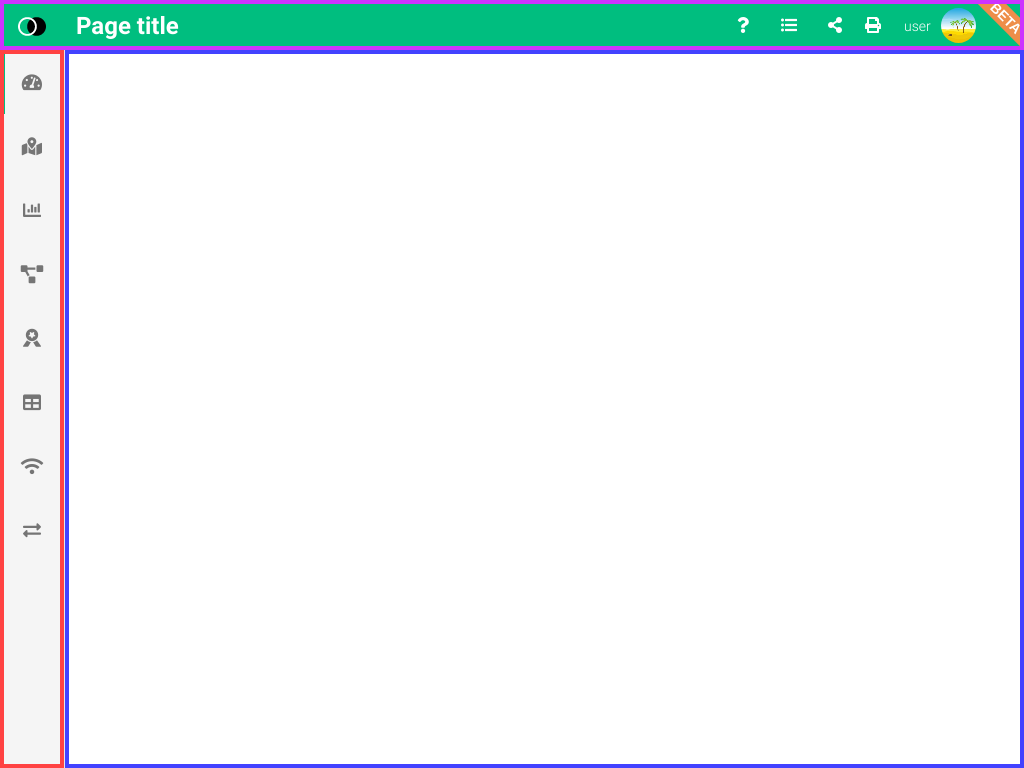
Fig. 5 Graphical user interface structure
Note
The menu items may vary depending on the permissions that the user has.
Header bar

Fig. 6 Header bar
The header bar shows on the left the title of the page you are viewing while on the right we have the following buttons:
Help ()
Changelogs ()
Share ()
Print ()
User menu (utente )
Side menu
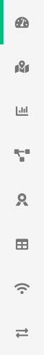
Fig. 7 Side menu |
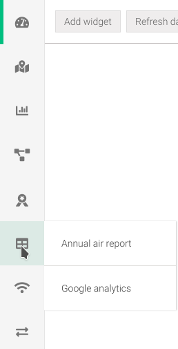
Fig. 8 Side menu with submenu |
From the side menu (Fig. 7), you can access the various functions of the application
Clicking on an menu item will bring up the desired screen, or if it has a submenu (Fig. 8) you will need to select one of these entries.
Tip
Holding the mouse over an icon for a few moments will suggest the title.
Warning
It is possible that not all menu items may be available because of the authorizations and permissions the user has.
Content
The content varies depending on what you have chosen from the menus in the header bar or side menu. The structure Fig. 9 is, for most pages, composed of:
a possible global filter bar (purple box),
a possible local filter bar (red box),
and the content (blue box).
The local fitri bar presents on the left all the components that allow content filtering while on the right are the action buttons for data management that usually bring up a window that allows add or modify an entry.
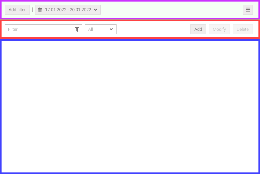
Fig. 9 Container structure
Global filter bar
The global filter bar (Fig. 10) is a feature that may be present on some pages. These filters once applied will be shared by all pages that have this feature. The global filter bar can be recognized by the light green background color.

Fig. 10 Global filter bar
Types of global filters
The global filters available are:
filtro per dominio,
filtro per campagna,
filtro per area amministrativa,
filter by date range.
When one of these filters is applied, all data that have to do with these paramaters are automatically filtered.
Adding and removing a filter
To add a filter click on the Add Filter button (Fig. 10) which will cause a pop-up window to open (Fig. 11, Fig. 12 or Fig. 13). At this point you can choose the type of filter by click on the Domain, Campaign or Admin area button and selecting one or more entries in the list below will activate the Add button.
The filters that will be added will be displayed in the filter bar (Fig. 15).
Note
Multiple selection items in the list can be done by holding down the ctrl key.
Note
The list of campaigns (Fig. 12) and administrative areas (Fig. 13) will be filtered depending on the items selected in the domains list (Fig. 11).
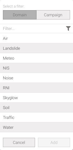
Fig. 11 Filter by domain |
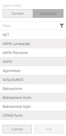
Fig. 12 Filter by campaign |
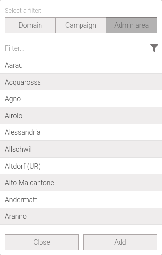
Fig. 13 Filter by administrative area
A filter can be removed by click on the button icon added to the bar (Fig. 15).
The date range filter is mandatory so by default a period is already selected. If you want to change this time range, click on the Date Range button (Fig. 10) and in the pop-up window (Fig. 14) you can change the period in the following ways:
changing the Start and End fields,
selecting a pre-set period from the Period drop-down menu,
by clicking two dates in the calendar.
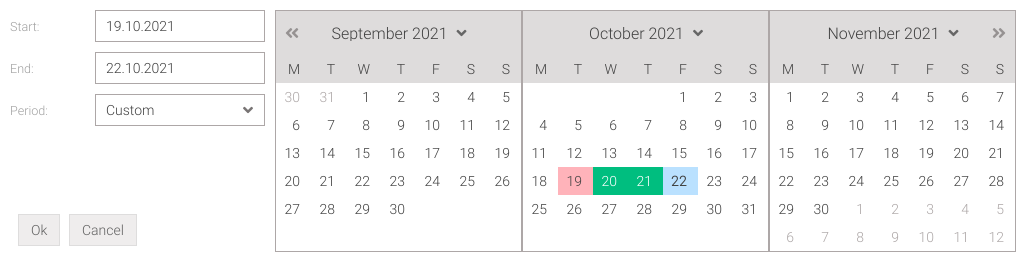
Fig. 14 Filter by date range
Enable/disable a filter
In addition to being removed, a filter can also be temporarily enabled or disabled by clicking on its text; disabled filters will be displayed in a slightly lighter color compared to enabled filters (Fig. 15).

Fig. 15 Example of selected global filters
Other actions
When filters have been added, the menu will be activated, located on the right side of the bar (Fig. 10). By clicking on it, you can access the follow options (Fig. 16):
: allows to reset all added filters
: allows to save currently selected filters in the Custom profiles widget of the dashboard
In addition to these two options, the names, if any, of all Custom profiles previously saved in the dashboard will be listed. Clicking on the name of a profile will load it immediately, deleting the current profile.
Fig. 16 Other actions on filters
For adding the profile to the dashboard, a window will appear where you will have to enter a name, as desired, that describes the following profile.
Local filter bar
The local filter bar (Fig. 17) allows data filtering on the current page and unlike the global filter bar is not shared with other pages; these filters are always present on the left side. On the right side there may also be buttons that allow actions on the data, which are usually add, modify or delete.

Fig. 17 Local filter bar
List and grid
Lists (Fig. 18) and tables (Fig. 19) are widely used in the application for data presentation.
Selected rows can be copied by pressing the Ctrl + C keys. The resulting format when pasting will be a TSV - Tab-separated values where the separator is a tab character - and if there is a new line in the text it will be replaced by a space. Any character styles will not be kept.
The selection of one or more rows can be done in several ways as if it were a spreadsheet:
select a row: click on a row to select it. Or use the keyboard to move over it and select it,
select a range: click a row and then with Shift pressed select another row. Or select a row and with the Shift key pressed, use the 🠑/🠓 keys,
select non-adjacent rows and ranges of rows: hold Ctrl key and select rows with left mouse button ,
select all rows: select a row and press Ctrl + A keys.
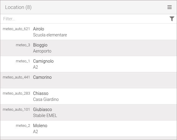
Fig. 18 List example |
Fig. 19 Grid example |
Tooltip
The tooltips are displayed when the cursor hovers over the a particular element, disappearing again when the cursor is moved away. In palma usually these tooltips are present on various buttons when they are not explanatory such as side menu icons.
There are also tooltips related to the content of lists/grids, in particular:
on the code of a location if enabled show codes (Fig. 20),
on the name of a parameter (Fig. 21),
on the name of a unit of measurement (Fig. 22).
Since location codes can be long these can be displayed in full with the tooltip. Parameter or measure unit names often do not give a clear indication of what is being displayed, and in this case the tooltip will be able to help by giving the full name and description.
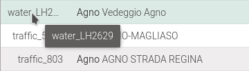
Fig. 20 Location code tooltip
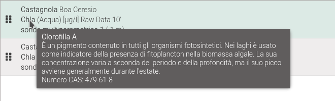
Fig. 21 Parameter tooltip |
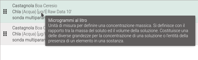
Fig. 22 Measure unit tooltip |
Data add/modify window
All data management operations will be showed in a window (Fig. 23) that can appear as a single window or as a step-by-step wizard.
On the header bar are the button to close the window without applying the changes and the button to open this manual directly in the section dedicated to the operation being performed. On the bottom there have the action buttons:
Cancel, on the left, allows you to undo changes
Done on right, to confirm changes
« Previous e Next » in the center, for the step-by-step procedure
Button names may differ from window to window. If the Next » and « Previous buttons are not visible, it means that the window does not have a wizard.
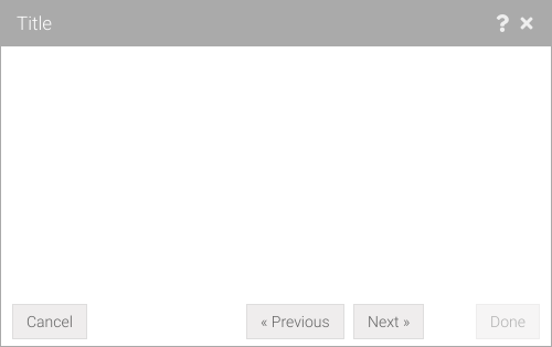
Fig. 23 Data management window
Tip
You can also close the window without applying the changes by pressing the Esc key.
Error reporting window
The application is capable of catching some errors automatically, when this happens a window (Fig. 24) will be showed allowing the error to be submitted.
The window presents a text area where you can specify the steps you took that led to the error. Although the system sends all the data about the problem, which can be viewed by clicking on the Developer Informations tab (Fig. 25), it is important that the user explain step by step what he or she did that led to the problem. More information given to developers allows the problem to be replicated and solved more easily.
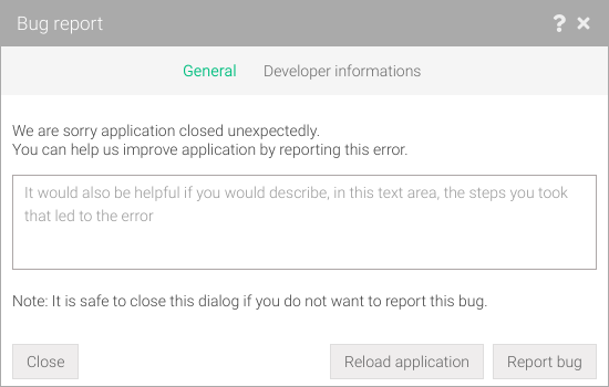
Fig. 24 Error reporting window |
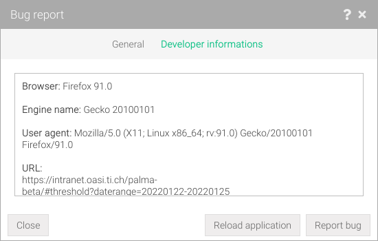
Fig. 25 Error report details |
Navigation buttons
Using the browser navigation buttons (Fig. 26) it’s possible to go forward/backward in the page visited in Palma in the exact sequence in which they were visited. By holding down on either button for a long time, it is possible to view the history of the pages visited (Fig. 27).

Fig. 26 Browser navigation buttons |
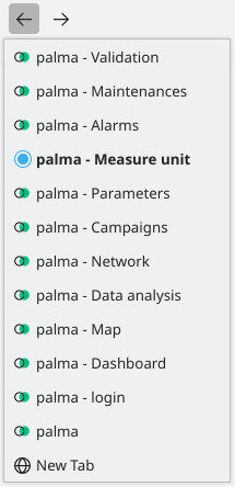
Fig. 27 History of visited pages |