Data analysis
The data analysis tool allows for charting representation of data automatically imported into the OASI database, via the Data Import/Export system, with different types of charts.
To access this tool click on the icon in the side menu.
Data selection
In order to be able to view the data it’s necessary to choose one wants to view and this is possible through the selection tool (Fig. 114).
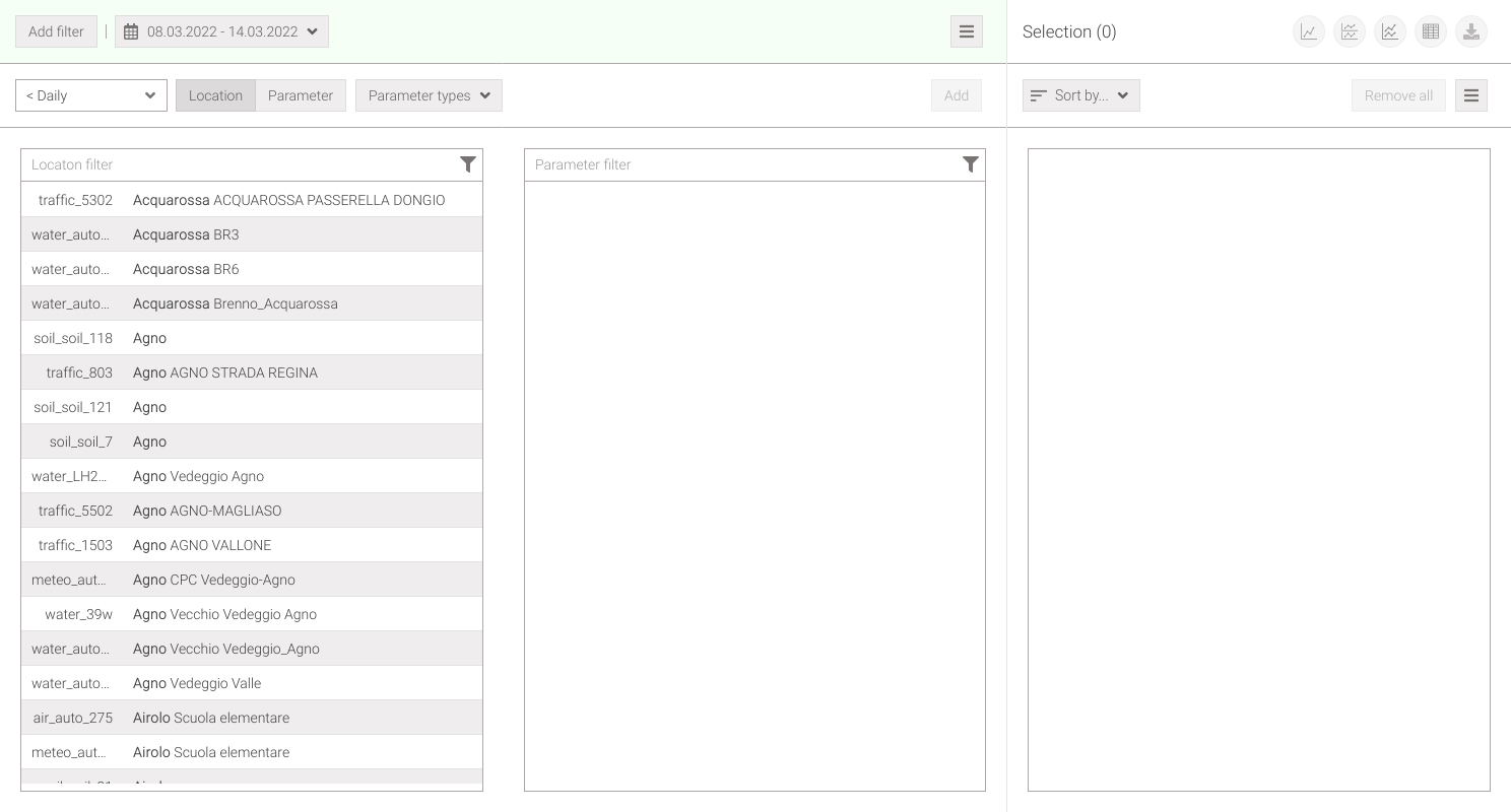
Fig. 114 Data selection
To better understand the selection, it’s recommended to read how the OASI system measurement network is structured.
The selection tool is divided into two parts:
on the left is the part that allows you to choose the metadata whose data one wants to view (or data series),
while on the right is the list of what has been selected and the buttons that allow the various data representation.
In the choice part by clicking on the Location button it’s possible to select, in the first list, a location to view the parameters that are measured on it (Fig. 115), while by clicking Parameter it’s possible to select a parameter and see at what locations it’s measured (Fig. 116). It’s also possible to filter for one or more parameter types by clicking on the drop-down menu; by default, all environmental type parameters are selected.
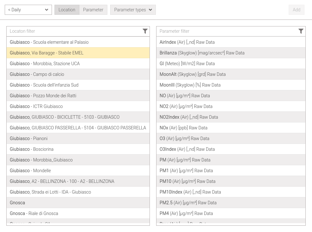
Fig. 115 Selection location -> parameter |
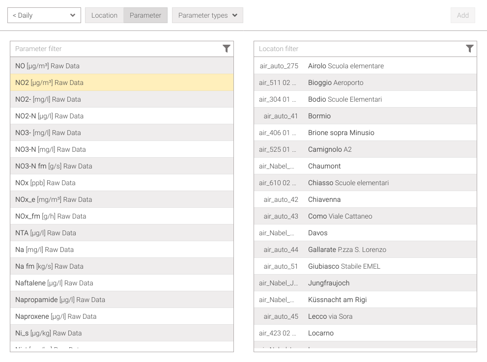
Fig. 116 Selection parameter -> location |
Selecting one or more parameters/locations from the second list will activate the btn:Add button, which by clicking it allows them to be added to the selection list on the right (Fig. 117).
In the Selection list there are the basic information shown on three lines:
the first line shows the city (in bold) and street (if set) followed by a personal label (if set),
the second line shows the parameter name (in bold), the domain name (in brackets), the measure unit, and the measurement type (raw data, mean, sum,…),
the third line shows the measurment point name and its relative height.
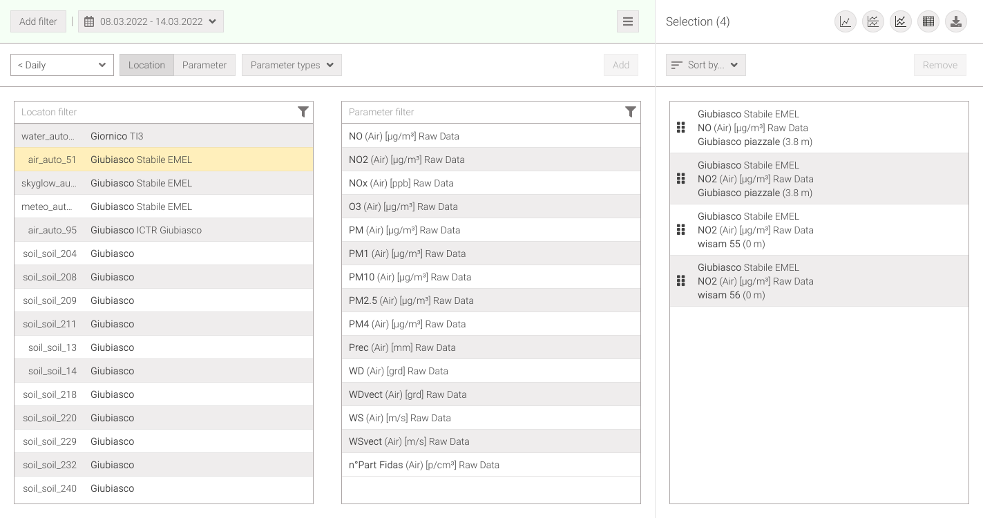
Fig. 117 List of selected points
If a chosen parameter/location has multiple measurement points (for example when there are several measurement systems in the same place or there are several measurement points for different heights) a window will open (Fig. 118) which allows to choose them.
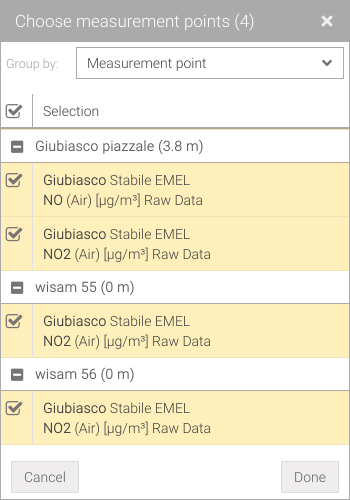
Fig. 118 Choice of measurment points
Data with different resolutions and aggregations can be combined via the < Daily drop-down menu, selecting to desired location/parameter and adding it to the list of selections.
Note
All displayed metadata can be filtered using the global filter.
Tip
In all lists, selected rows can be copied.
Reorganize the selection
Reorganizing the selection list is useful because it allows maintaining this order even in the visualization of charts, reports, and exports.
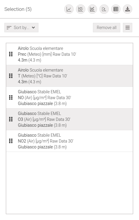
Fig. 119 Selection list
The selection can be reorganized using the dropdown menu (Fig. 120). This allows to choose the desired sorting type and direction, either ascending or descending .
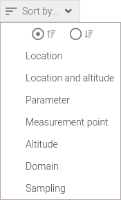
Fig. 120 Dropdown menu ‘Sort by…’
The elements in the selection list can be reorganized through drag and drop. By holding down the left mouse button on the icon while dragging it (Fig. 121) allows you to change the order of the list (Fig. 122). It’s also possible to move a group of elements if they are selected.
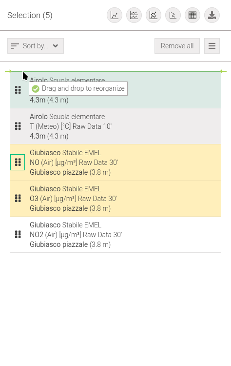
Fig. 121 Drag and drop of selection element example |
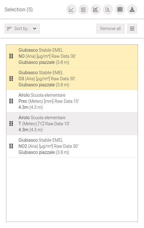
Fig. 122 End dragging the selection element |
Save selection
The Selection can be saved in the Custom data selection widget by clicking on the button and then on the menu option (Fig. 123).
Fig. 123 Other actions on selection
This will open a window (Fig. 124) where will have to enter a name, as desired, that describes its function. Clicking Done will send you back to the Dashboard page.

Fig. 124 Selection name setting
Load selection
A previously saved Custom data selection in the dashboard can be loaded by clicking on the button, which will bring up a menu that lists, in addition to the action of adding the selection to the dashboard, the names of all custom selections, if any (Fig. 123). Clicking on the name of a selection will immediately load it into the of the list of selections by deleting the current selection.
Data visualization
Once the metadata of interest is selected, one has the option of viewing it in the following way:
with a chart,
with a tabular report,
with a data export in
.csvformat.
Charts
All views through one or more charts in Palma are structured in the same way (Fig. 125) and made up of three elements:
a toolbar that allows to do operations on the chart (red box)
a legend with the list of selected data series (purple box)
and the chart(s) (blue box)
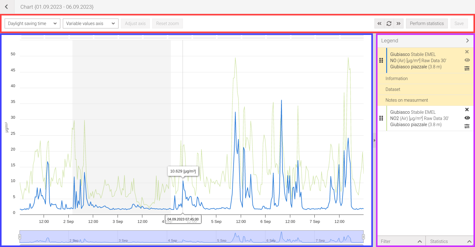
Fig. 125 Chart user interface
In turn, the chart has the following elements (Fig. 126):
of the problem reporting bars (red box),
the chart with the reference axis and one or more values axes (purple box),
the navigator that allows zooming chart (blue box).
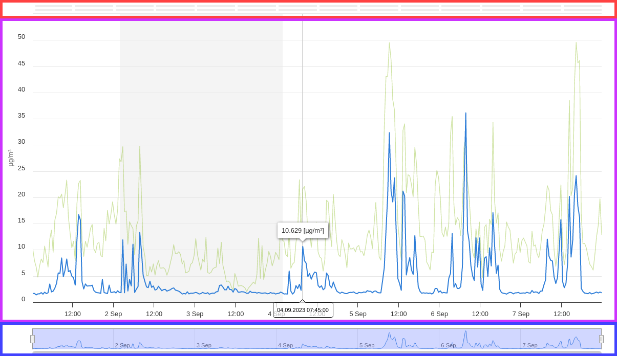
Fig. 126 Chart elements
Note
Some chart elements may be unavailable for some chart types.
Charts types
One can show the data with different types of charts, which are:
Some of the actions listed in this document may not be available, or work differently, for some types of charts and will be deepened in the appropriate section.
Single chart
To access this view once a selection has been made click on the button .
The single chart (Fig. 127) allows multiple data sets to be displayed in a single chart.
In this type of chart, the reference axis, a time series, is arranged horizontally (X) while the axes of values are displayed vertically (Y).
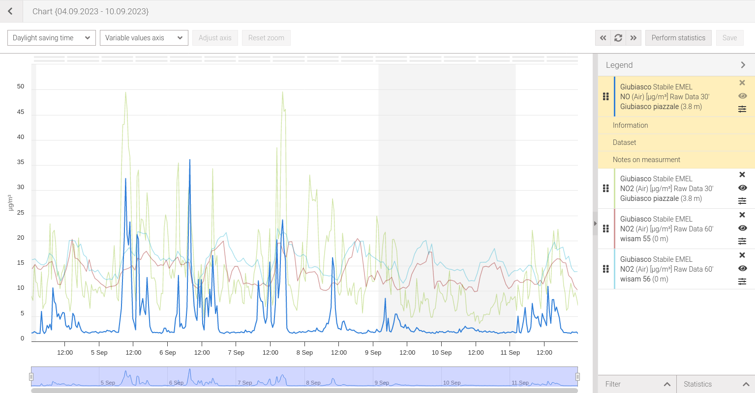
Fig. 127 Single chart
Multiple charts
To access this view once a selection has been made click on the button .
Multiple charts (Fig. 128) allow to show multiple data sets in cascaded, each in a different chart.
In this type of chart, the reference axis, a time series, is arranged horizontally (X) while the axes of values are displayed vertically (Y).
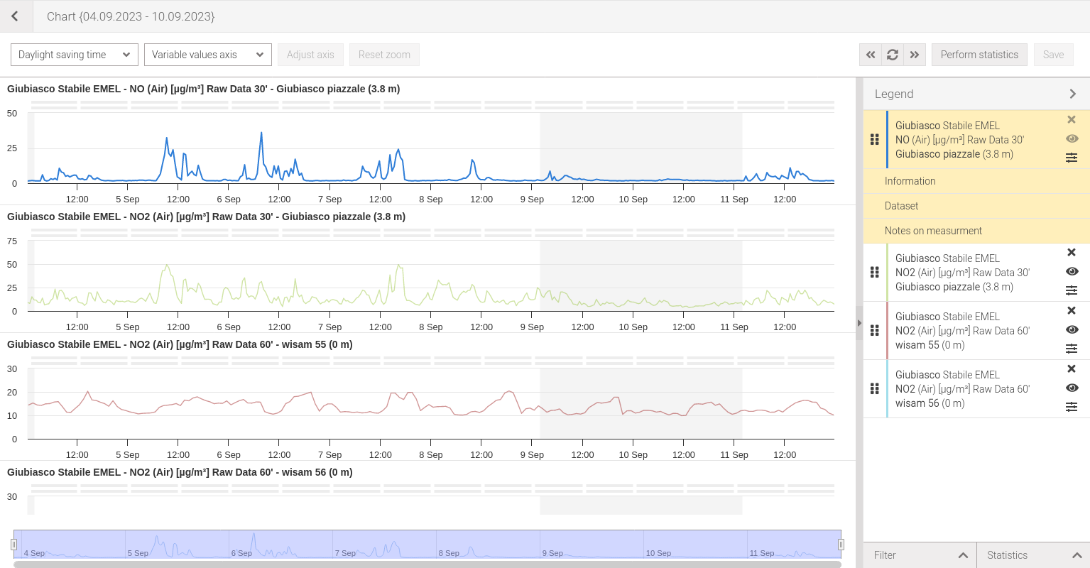
Fig. 128 Multiple charts
Weekly chart
To access this view once a selection has been made click on the button. If the selected period does not include exactly 7 days, it will be proposed with a window (Fig. 129) to choose a period of exactly one week.
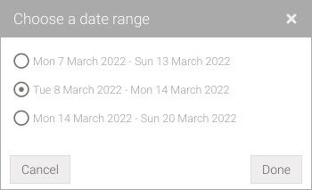
Fig. 129 Choice of the Week
The weekly chart (Fig. 130) allows one series at a time to be displayed in the daily/weekly format so that the parameter is represented according to the time of day and aggregated by day of the week.
In this type of chart, the reference axis, a time series, is arranged horizontally (X) while the axes of values are displayed vertically (Y).
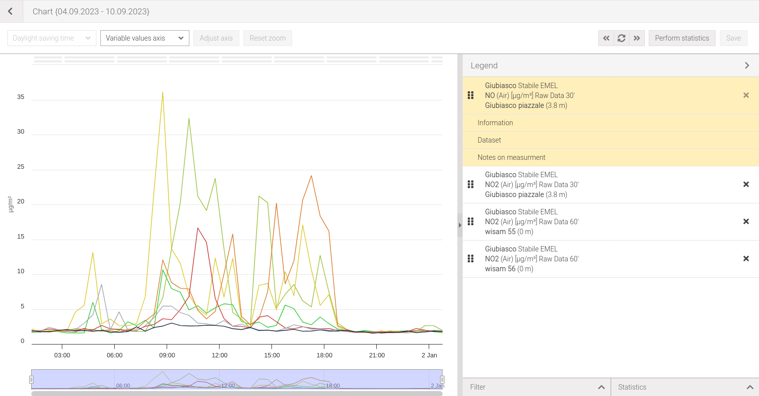
Fig. 130 Weekly chart
Profile chart
To access this view once a selection has been made click on the button .
The profile chart (Fig. 133) allows to view the values of a given parameter as a function of its altitude at a given moment in time. The altitude is determined by the altitude of the point plus its relative height. For this reason, parameters at a given location that possess two or more measurement points with different altitudes will have to be chosen. In fact, the chart will be displayed aggregating by location, parameter and sampling time. If the selection is incorrect you will be alerted with warning messages (Fig. 131, Fig. 132).
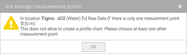
Fig. 131 Incorrect selection: only one measurement point selected
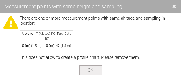
Fig. 132 Incorrect selection: measurement points with the same altitude
In this type of chart the reference axis, a series of heights, is arranged vertically (Y) while the axes of values are displayed horizontally (X).
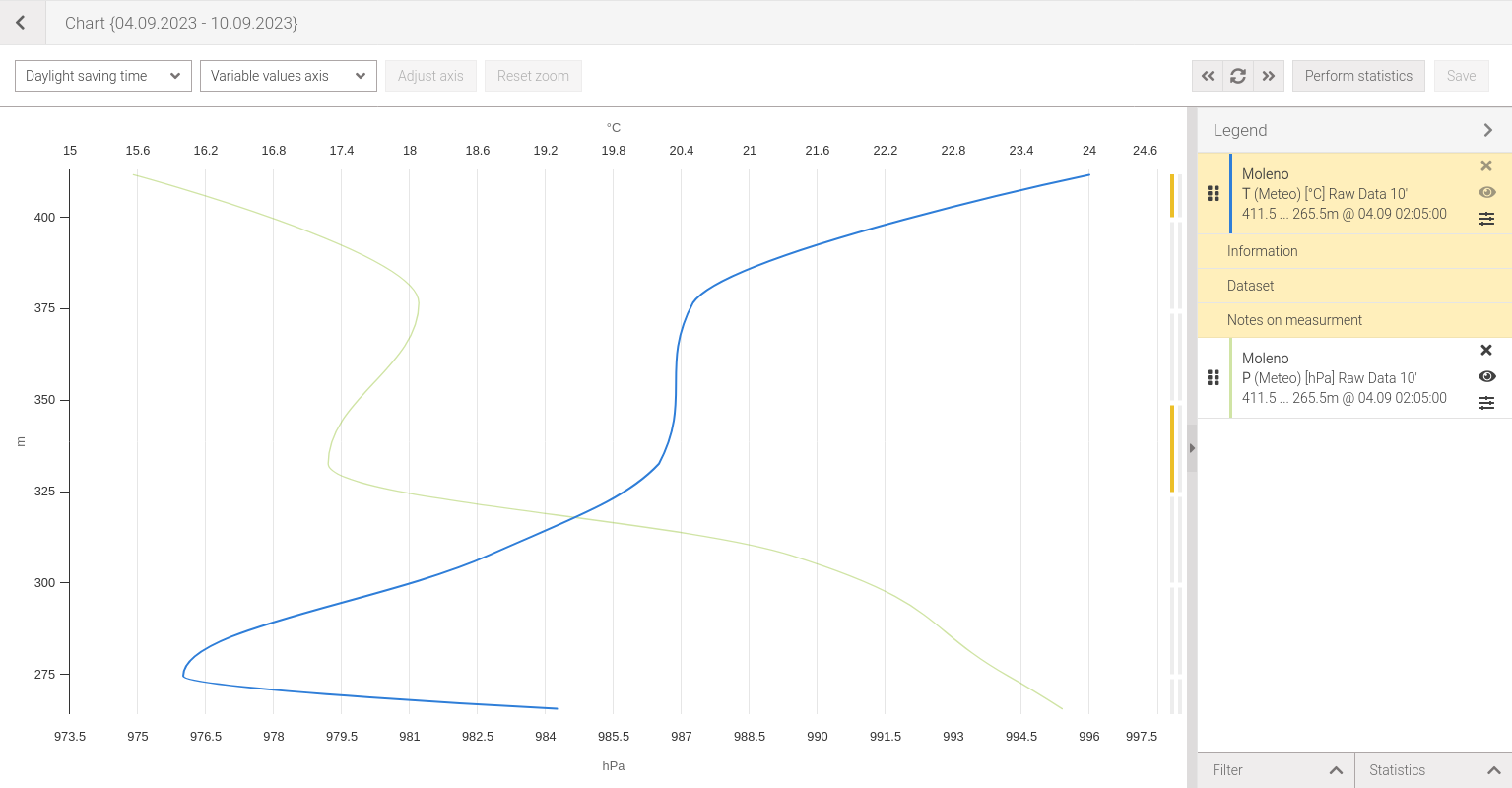
Fig. 133 Profile chart
Displaying values
Placing the mouse over any point on the graph will display the measurement value and date/time of acquisition at that point (Fig. 134) referring to the selected data set.
By clicking with the left mouse button , on the point whose value you want to know, will open the data set table highlighting the value.
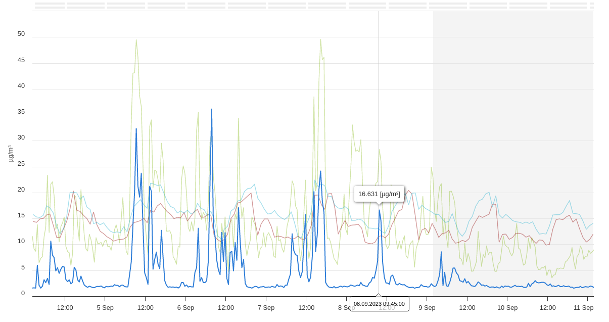
Fig. 134 Displaying values in the single, multiple and weekly charts
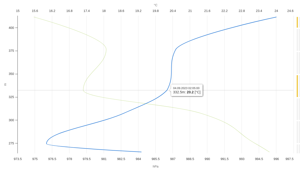
Fig. 135 Displaying values in the profile chart
Problem reporting bars
All charts have two bars (Fig. 136), positioned at the top and composed of strips of the length of the graduation marks (ticks) of the reference axis, which allow easy identification of problems with data referring to the selected data set.
If there is corrupted or suspected data (see Quality Control section for more information) at a time period (tick) the first bar will be colored orange, and if data is missing the second bar will be colored red.
If the stripes are gray, it means there is no problem with the data for that period.
Placing the mouse over one of the colored stripes will provide more information (Fig. 137 e Fig. 138).

Fig. 136 Problem reporting bars
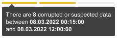
Fig. 137 Tooltip for corrupted or suspected data |
Fig. 138 Tooltip for missing data |
Note
In the profile chart, the problem reporting bars are displayed on the left side vertically.
Zooming the chart
All charts have, excluding the profile chart, have a navigator on the bottom (Fig. 139) where the selected series in the chosen period is represented.
Dragging one of the two grips allows to adjust the time interval of the chart (zoom). It’s possible to zoom in/out by moving the mouse anywhere on the chart and using the mouse wheel . Zooming through the mouse wheel is also present for the profile chart.
To return to the initial zoom click on the Reset zoom button located on the chart toolbar.
By holding down the left mouse button on the part highlighted in blue, or on the scroll bar, it’s possible to move time interval in the two directions and dragging the cursor in the desired direction.

Fig. 139 Chart navigator
Measurement selection
To select measurements hold down the left mouse button on the chart and drag the cursor until the desired rectangular area is obtained (Fig. 140). When the mouse button is released, the selected series measurements within this area will be highlighted in red (Fig. 141).
Upon selection of one or more measurements in the legend, the data set will be automatically showed.
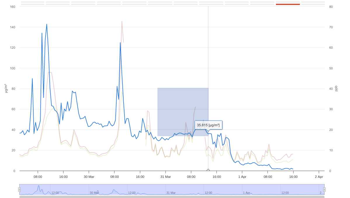
Fig. 140 Selection box
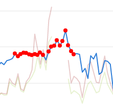
Fig. 141 Selected measures
Tip
New points can be added to the current selection by holding down the Ctrl key.
Add/remove a constant on the axes
Constants (demarcation lines) can be added on the visible axes (Fig. 142) by clicking with the right mouse button on the desired point in the chart, this will bring up a menu which allows to add a constant on the reference axis (Fig. 143) or on the value axis (Fig. 144). The proposed value, both for the reference axis and for the value axis, is the one clicked on and can be modified by changing the value in the relative Value field.
If there are multiple values axes to add the constant on the desired axis be sure to select a series relative to the axis where one wants to add the constant.
To remove a constant double-click in possimity of the constant one wants to remove.
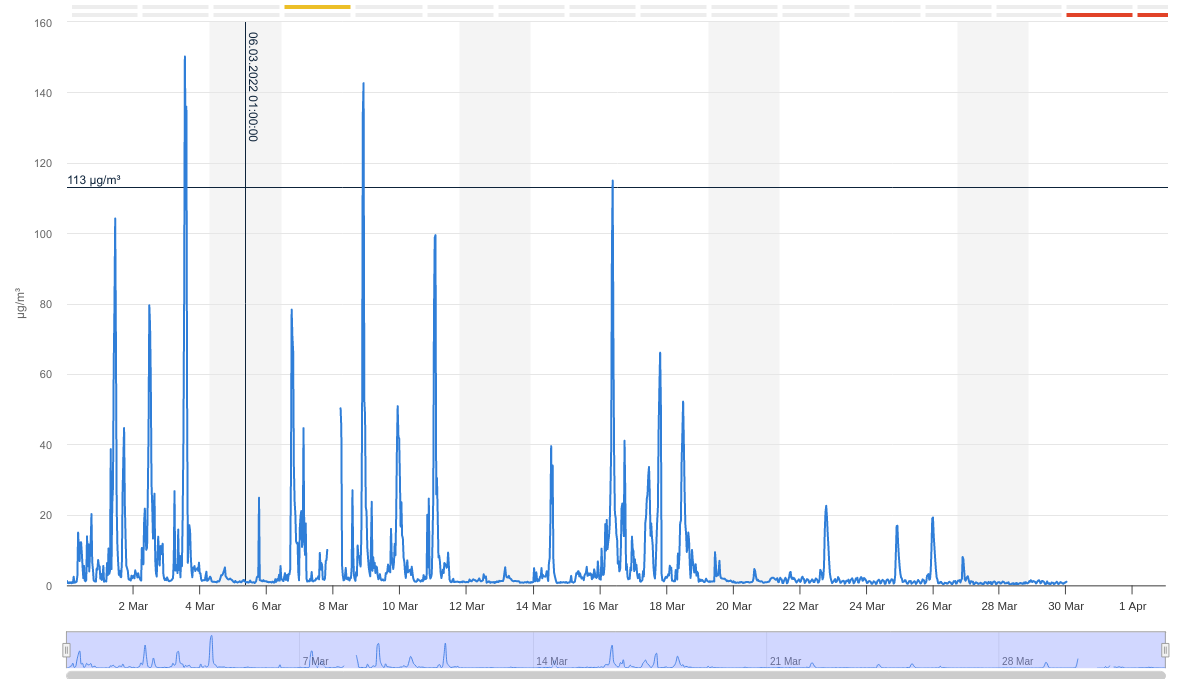
Fig. 142 Chart with constants lines
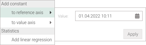
Fig. 143 Add constant to reference axis |
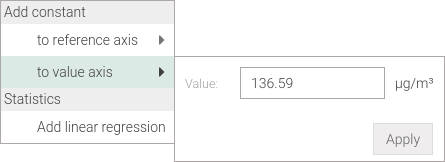
Fig. 144 Add constant to values axis |
Tip
This operation is useful when one want to select measurements that are above or below a certain value.
Add/remove a linear regression
Linear regression (Fig. 145) can be added on the selected series by clicking on any point in the chart, this will bring up a menu allowing the addition (Fig. 146).
When a linear regression is added the statistics view is automatically opened (Fig. 147) where the function and the coefficient of determination (R²) is displayed.
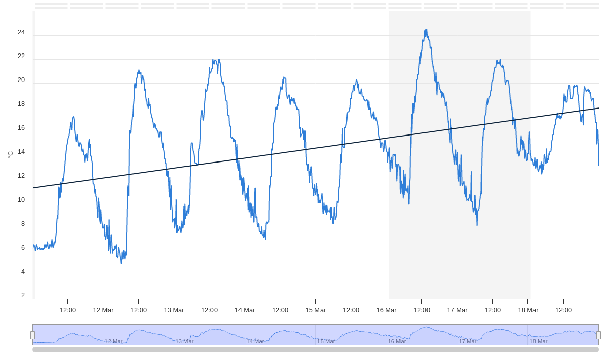
Fig. 145 Chart with linear regression
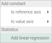
Fig. 146 Add linear regression |
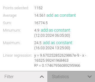
Fig. 147 The function and R² values of the linear regression |
The linear regression is recalculated based on the data displayed in the chart. This means that it is recalculation takes place at the selection and/or the application of filters on the data (Fig. 148).

Fig. 148 Chart with linear regression calculated on the selected points
To remove the linear regression double-click on it.
Note
In the time series charts for the values of the reference axis the number of milliseconds that have passed since January 1, 1970 (UNIX time) is used.
Change time type
The date/time of the measurements can be displayed in two types of times:
Coordinated Universal Time +1 hour (UTC+1)
Daylight saving time (Europe/Zurich)
Coordinated Universal Time allows all times, regardless of whether winter or summer, to be displayed in UTC+1, this means that the summer time change is not taken into account. Daylight saving time allows you to display the time, in the Europe/Zurich time zone, with the summer time change. This option is the default.
To change the type of time, select the desired one from the first drop-down menu (Fig. 149).
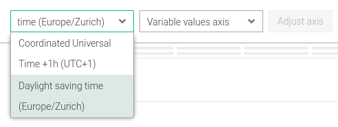
Fig. 149 Time type change
Note
In the weekly chart is not allowed display in Coordinated Universal Time (UTC+1).
Change the scale to the reference axis
Use the zoom function to change the scale to the abscissa axis.
Note
In the profile chart, the reference and value axis are reversed.
Change the scale to the values axis
By default, Palma determines the minimum and maximum scaling values of the value axis automatically when a chart is created. However, it’s possible to customize the scale by selecting the item from the second drop-down menu (Fig. 150) and finally clicking on the Adjust axis button.
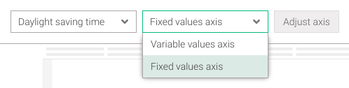
Fig. 150 Values axis fixed
This will show a window that allows changing the scale and the graduation marks of the value axis (Fig. 151). Choose the axis whose scale you want to change from the drop-down menu and then change its values with the Min, Max and Tick interval fields; perform the same procedure on all desired axes. To make the changes effective, click on the Apply button.
Leaving blank the Tick interval field will cause the graduation marks to be calculated automantically.
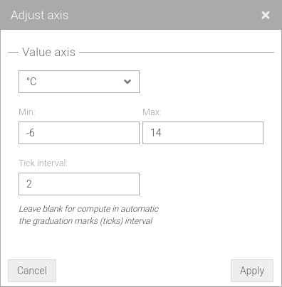
Fig. 151 Change scale to value axis
Note
In the profile chart, the reference and value axis are reversed.
Print
Once a chart is displayed it can be printed by clicking on the button in the header bar. From the Print Options window (Fig. 152 and Fig. 153) it’s possible to choose whether to print as PDF or as an SVG vector image by changing the Type. For the PDF type it’s possible to choose from four Orientation types:
A4 landscape
A4 portrait
A3 landscape
A3 portrait
while if the SVG type was chosen it’s possible to change the Size of the image, by default the size is identical to the graphic displayed.
The option Keep selected series highlighted allows to keep the transparencies of the series as they are displayed, i.e. the selected one highlighted. If the option is disabled there will be no series highlighted, therefore none will have a transparency.
To download the desired print, click on the Print button.
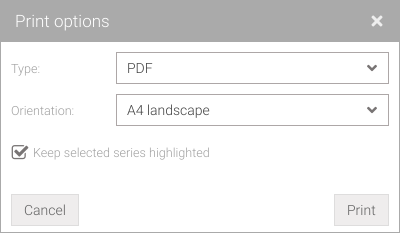
Fig. 152 Print chart in PDF format |
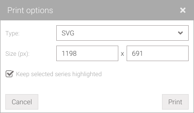
Fig. 153 Print chart in SVG format |
Warning
If the PDF type or different size for the SVG type was chosen the printed chart will differ from the one displayed.
Legend
The legend for the single, multiple (Fig. 154) and weekly (Fig. 155) charts presents a list of all the data series that are previously selected. For the profile chart (Fig. 156), data series are represented but aggregating by location, parameter and sampling.
The information for each item in the legend is given on three lines. On the first we find the town (in bold), the street (if set) and the custom label (if set). The second shows information on the name of the parameter (in bold), the domain to which it belongs (in round brackets), the unit of measurement (in square brackets), the type of measurement and the sampling period. In the last line, the name of the measurement point (in bold) and its relative height (in round brackets) are reported.
For the profile chart (Fig. 156) - given that the series are created aggregating by location, parameter and sampling time at given moment - the range of altitudes of the measuring points and sampling time are shown on the last line.
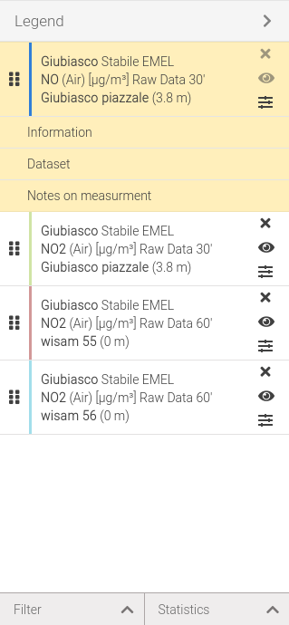
Fig. 154 Chart legend of single and multiple chart |
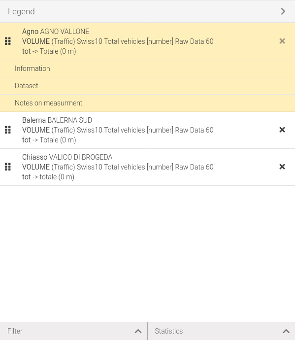
Fig. 155 Chart legend of weekly chart |
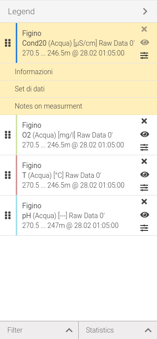
Fig. 156 Chart legend of profile chart
Management of selected series
To select a series click on the desired item in the list (Fig. 157), it will be highlighted both in the chart (more marked line) and in the legend with a yellow background color (Fig. 158).
The selected series will show a menu where you can view additional information or view the data set in tabular form.
Only on the selected series is it possible to interact in the chart (Displaying values, Problem reporting bars, Measurement selection). Only one series can be selected.
Fig. 157 Legend item |
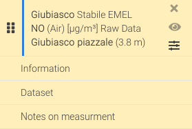
Fig. 158 Legend item selected |
It’s possible to reorder series by drag and drop. Holding down the left mouse button on the icon, of a series while dragging it gives ability to change the order of the list.
Click on the button to remove the series from the list and chart.
The button allows to temporally enable and disable the visibility of the series on the chart.
Warning
The selected series cannot be removed or disabled, consequently the and buttons are disabled (Fig. 158).
Note
In the weekly chart it’s not possible to disable a series, so the button will not be visible.
It’s possible to change the type and color of the series by clicking the button. This will open a window (Fig. 159) that allows to change the color of the series by editing the Color field or to change the type by editing the Type drop-down menu. The available types are:
Line (Fig. 160): does not connect two points if there is missing data in between,
Line (connect nulls) (Fig. 161): allows the continuous line to be seen even when data is missing,
Spline (Fig. 162),
Point (Fig. 163),
Bar (Fig. 164),
Line and point (Fig. 165),
Line step (Fig. 166).
Activating the Apply to all series option it’s possible to change the chart type for all series.
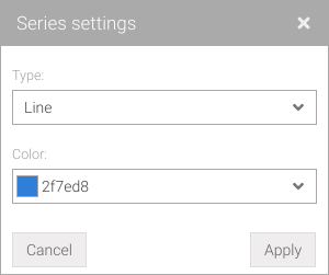
Fig. 159 Series settings
Fig. 160 Line series type |
Fig. 161 Line series type (connect nulls) |
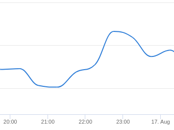
Fig. 162 Spline series type |
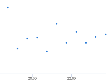
Fig. 163 Point series type |
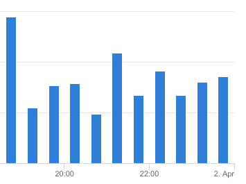
Fig. 164 Bar series type |
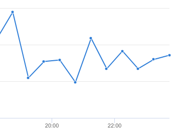
Fig. 165 Line and point series type |
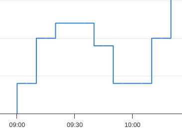
Fig. 166 Line step series type
Note
In the weekly chart, it’s not possible to change color or chart type, so the button will not be visible.
View series information
To access the information of a series, first select it and then click on .
The available information can be seen in Fig. 167.
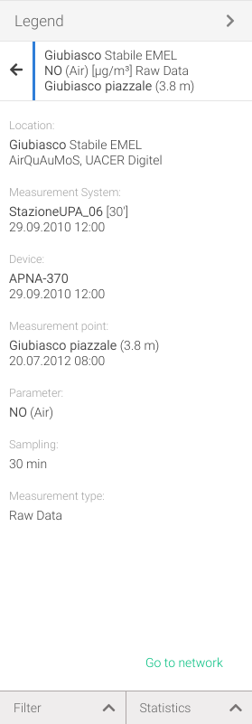
Fig. 167 Additional information of the selected series
By clicking on the Go to network link, it’s possible to display the measurement network screen with preselected location, measurement system and device.
View the series dataset
To access the information of a series, first select it and then click on .
The view of the data set varies according to the chart selected but the features remain the same.
In the single or multiple chart the data set displays in tabular form (Fig. 168) the acquisition date, values and status (see Quality control section) of the measurements in the series.
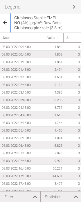
Fig. 168 Data set of the selected series in the single/multiple chart
In the weekly chart the data set displays in tabular form (Fig. 169) the time of acquisition, values and status (see Quality control section) for each day of the week of the series measurements.
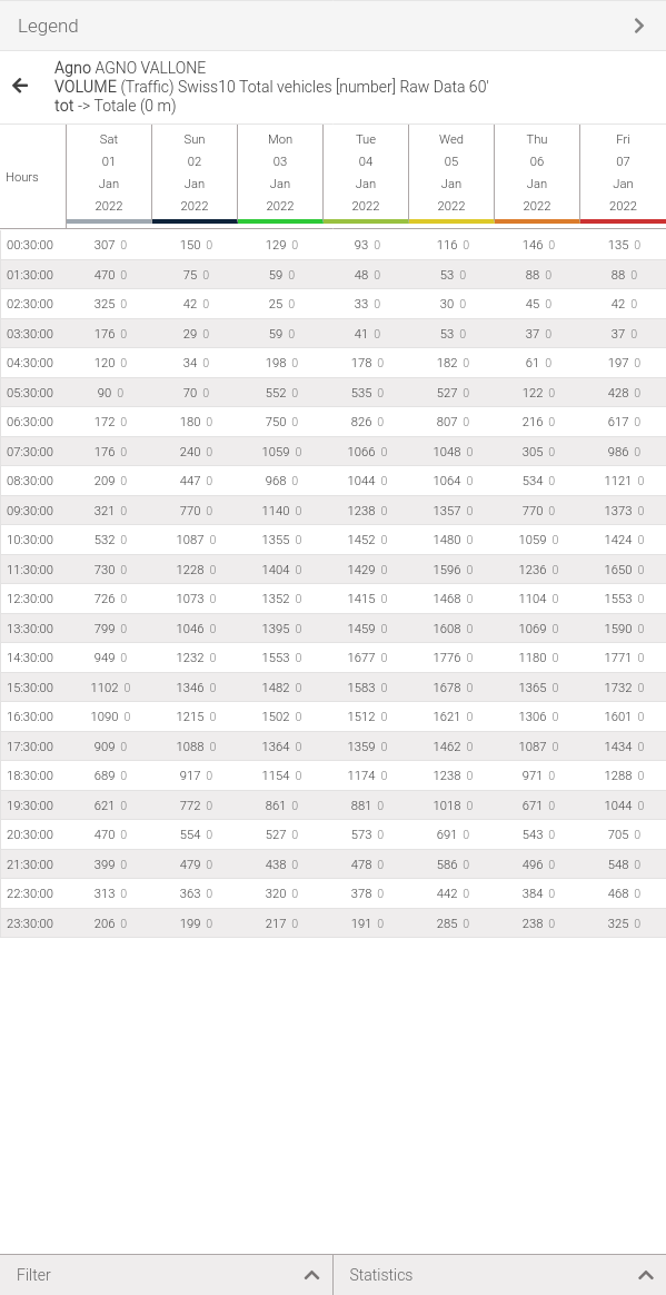
Fig. 169 Data set of the selected series in the weekly chart
In the profile chart, the data set displays in tabular form (Fig. 168) the altitude, values and status (see Quality control of the series measurements.
Also displayed at the bottom are all the sampling times over the period previously chosen in the selection. Clicking on a sampling will update the data and chart for that specific time.
Activating the Apply to all series with the same sampling option if other data series with the same sampling exist in the selection will also be updated when a new sampling time is selected.
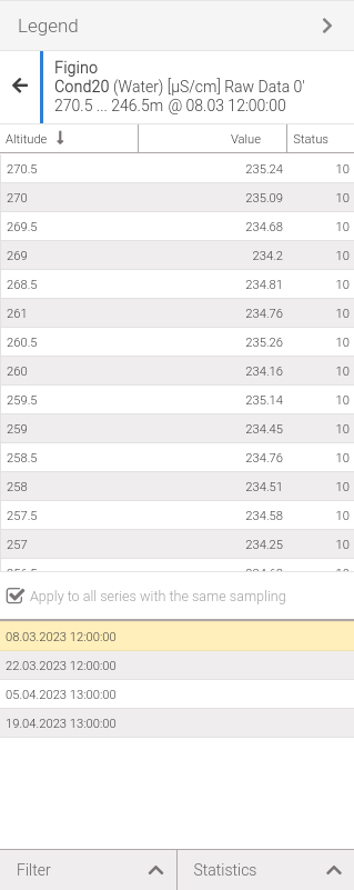
Fig. 170 Data set of the selected series in the profile chart
By selecting measurements in the table this will also be selected in the chart.
Data representation
- Each cell in the table can have the following indications: (Fig. 171):
① row highlighted in light green: the device has reported a status (not to be confused with measurement status),usually this happens when an device gives a value that is above or below its sensitivity,
② value highlighted in dark blue and bold: the data has been marked as suspected,
③ value shows a speech balloon : the data, or its status, has been changed by adding a note,
② value highlighted in orange and bold: the data has been marked as corrupted,
② row highlighted in light red: the data is missing,
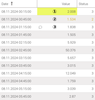
Fig. 171 Data representation
It’s possible to view device status or note by hovering the mouse over the Value column (Fig. 172) or by activating Device status/Note by moving the mouse over the table header and clicking the pop-up button an then clicking on and finally checking the ones of interest (Fig. 173).
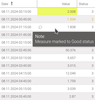
Fig. 172 Display device status/note by tooltip |
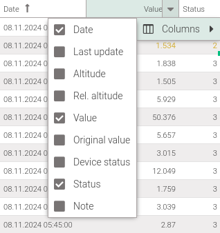
Fig. 173 Display hidden columns |
Warning
Some data may not be visible because it’s filtered by measurement status, so be sure to select the correct filters.
Tip
In all data grid, selected rows can be copied.
View series notes
To access the list of any notes on a series, first select it and then click on .
Fig. 174 displays all the notes that are in the series showing the dates of the measurements in which the note was applied and the text of the note.
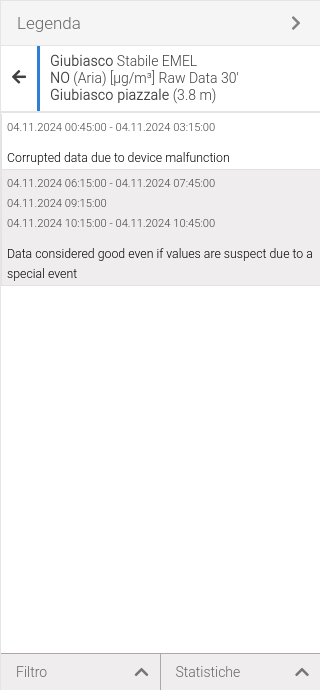
Fig. 174 Notes on the measurements of the selected series
Selecting one or more notes will select the corresponding points on the chart as well.
Notes on measurements can be applied when modifying data.
Note
It’s possible to view the note text from the measurement table.
Filters
Data from all series can be filtered by measurement status.
To access this feature click on the Filter button located at the bottom of the legend. A panel will open (Fig. 175) where it’s possible to choose which status to have displayed. By default the status displayed are:
[0] Raw data
[2] Suspect
[3] Good
[8] Good (correction applied)
[9] Good (special event)
[10] Good
These filters affect both the visualization of the data set and the visualization of the chart.
It’s also possible to select only data with a certain status by clicking on the select link related to the status. This is only possible if data in that state is displayed.
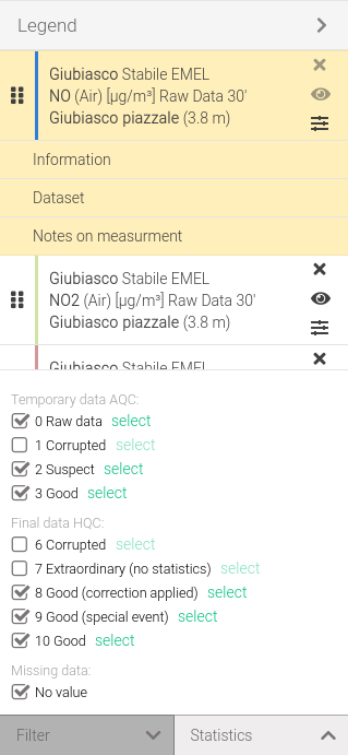
Fig. 175 Filters based on measurement status
Statistics on the series
Some statistics about the selected series can be viewed.
To access this feature click on the Statistics button located at the bottom of the legend. A panel will open (Fig. 176) where statistics will be displayed that relate either to the selected series or to a selection of data also based on active filters.
It is also possible to add:
a linear regression by clicking on the Add linear regression link.For more information, read the dedicated section.
a constant with the value of the mean, minimum or maximum by clicking on the link add as constant. For more information, read the dedicated section.
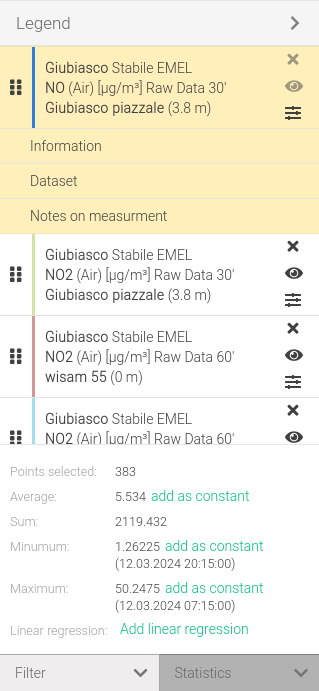
Fig. 176 Statistics for the selected series
Refresh and moving data
Data refresh is used to update (reload) the dataset that is being analyzed. This functionality can be accessed by clicking on the button located in the toolbar.
Using the and buttons, located on the chart toolbar, it’s possible to move to a previous or next period with respect to the complete period selected, for example by choosing to view 30 days it’s possible to go forward and backward 30 days at a time.
In the profile chart, which displays the values of a given parameter as a function of its altitude at a given timestamp, these buttons allow to move on the previous/next sampling. For example, choosing to display a measurement system with sampling every 10 minutes buttons allow to move forward or backward to the next 5-minute chart within the chosen period.
Modifying the text of a note
It’s possible to edit a text of a note added during data modification. To access this feature go to the notes list, select the note to edit, right-click to open the context menu that allows you to choose (Fig. 177). This will open a window (Fig. 179) where you can edit the text of the note.
All changed notes are not automatically stored in the database and will be indicated with a red triangle in the cell where a change occurred (Fig. 178). To make the changes effective click on the Save button located at the top right of the screen; if the operation is successful the red triangle will be removed.
Warning
Remember that a note can be associated with more than one measure, so when an edit occur the change will be for all measures related to the modified note. Select the note to view the measures associated with it on chart.
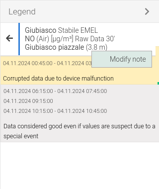
Fig. 177 Context menu edit note |
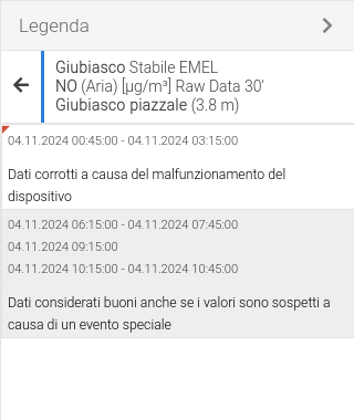
Fig. 178 Cells with locally modified text note |
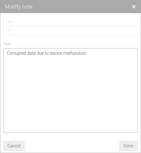
Fig. 179 Window for note editing
Report
All views through one or more charts in Palma are structured in the same way (Fig. 180) and made up of three elements:
a toolbar that allows to do operations on the table report (red box)
a sidebar with statistics of selected data sets (purple box)
and the table with data (blue box)
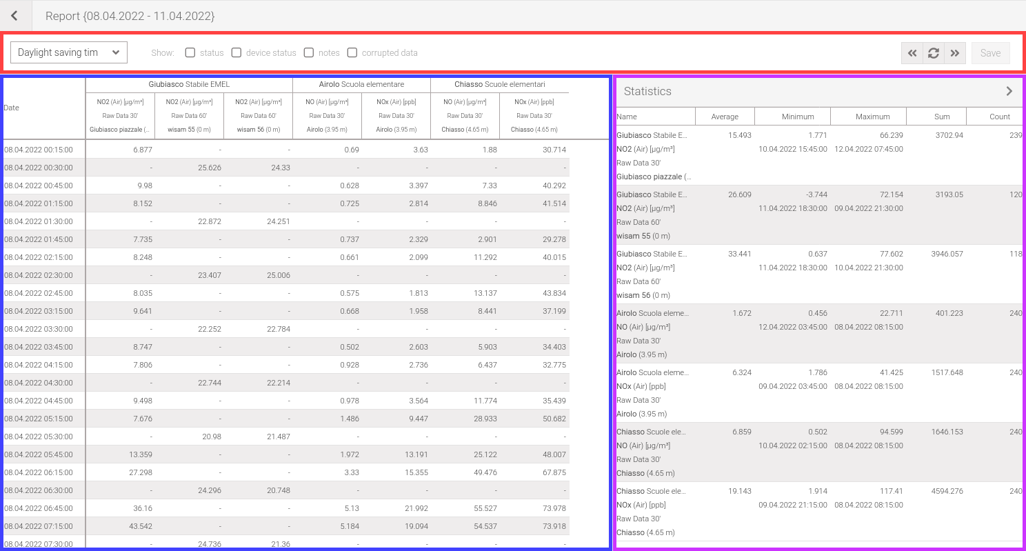
Fig. 180 Report user interface
Report types
It’s possible to show the data with different types of report, which are:
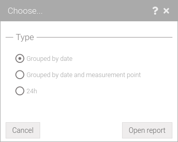
Fig. 181 Report types
Report grouped by date
To access this view once a selection has been made click on the button and in the options window (Fig. 181) select Gruped by date.
This type of report (Fig. 182) allows selected data sets to be displayed grouped and sorted by date. The columns then represent the parameter, measurement point and the sampling.
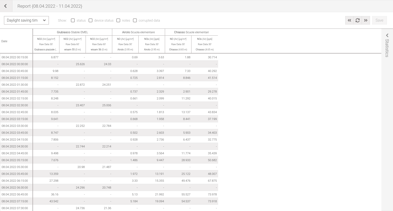
Fig. 182 Report grouped by date
Report grouped by date and measurement point
To access this view once a selection has been made click on the button and in the options window (Fig. 181) select Gruped by date and measurement point.
This type of report (Fig. 183) allows selected data sets to be displayed grouped and sorted by date. The columns then represent the parameter and the sampling.
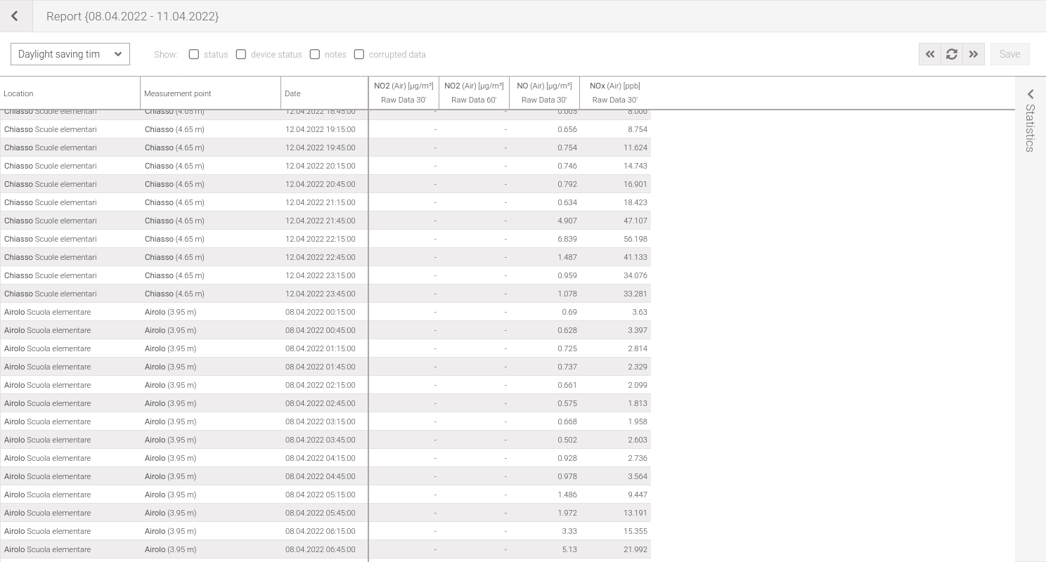
Fig. 183 Report grouped by date and measurement point
24h report
To access this view once a selection has been made click on the button and in the options window (Fig. 181) select 24h.
This type of report (Fig. 184) allows selected data sets to be displayed according to time of day and aggregated by location, point of measuera, parameter and day.
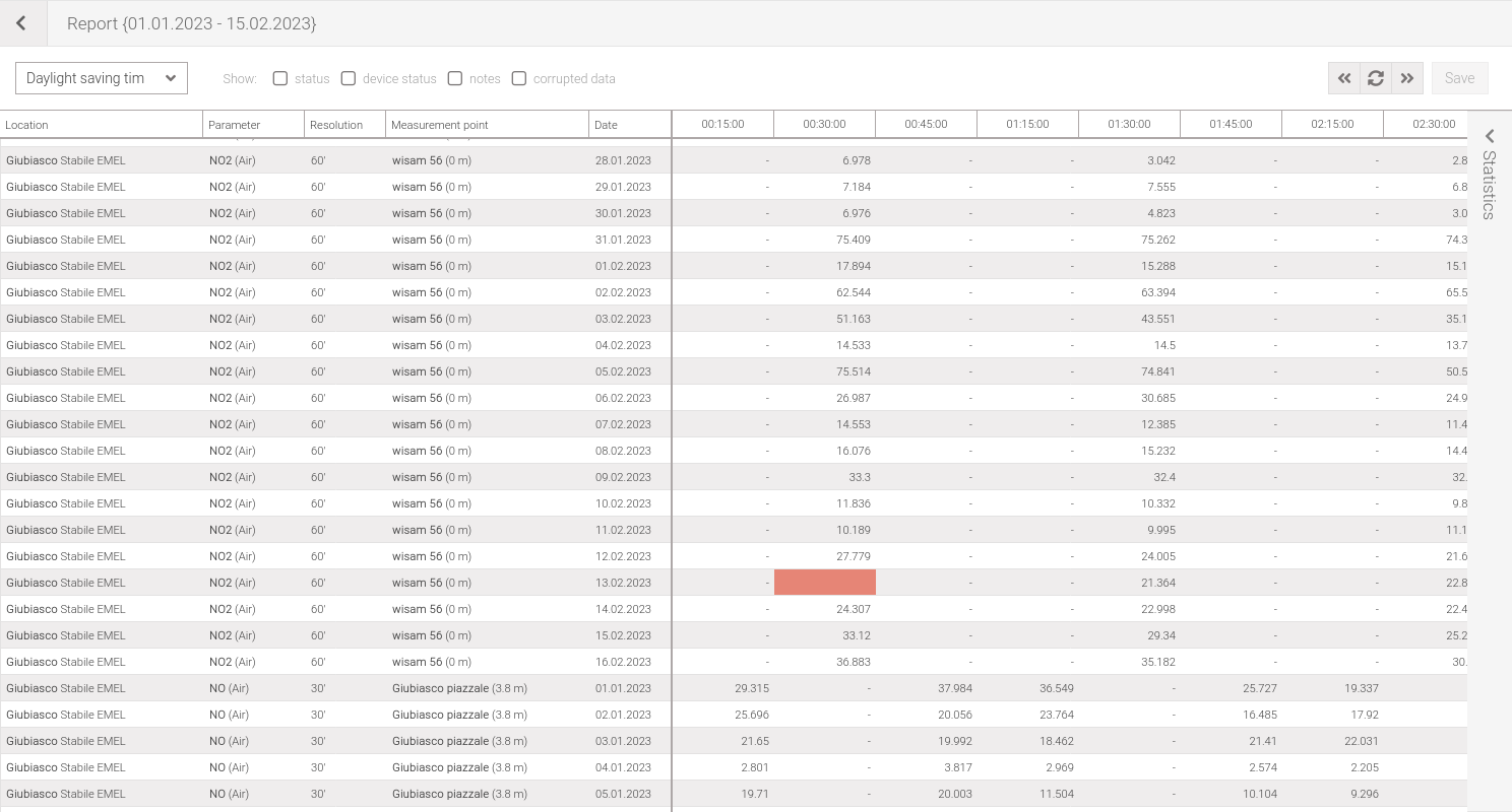
Fig. 184 24h report
Data representation
Each cell in the table can have the following indications:
① symbol -: an unpredictable value (e.g., at different sampling times the instants are different),
② value shows a speech balloon : the data, or its status, has been changed by adding a note,
② no value and highlighted in light red: the data is missing,
④ an ‘x’ (if the option Show:corrupted data is disabled) or value colored in orange and bold: the data has been marked as corrupted,
⑤ value highlighted in light green: the device has reported a status (not to be confused with measurement status),
⑥ value highlighted in dark blue and bold: the data has been marked as suspected.
The following information can also be viewed:
the measurement status by clicking on the check box Show:status,
the device status by clicking on the check box Show:device status,
the measurement notes by clicking on the check box Show:notes,
the value of the suspected or corrupted data (otherwise an ‘x’ will be displayed) by clicking on the checkbox Show:corrupted data.
Device status and notes, if any, can also be displayed via tooltips by hovering the mouse over the measure value.

Fig. 185 Data representation
Change time type
It’s possible to change the type of date/time by selecting the desired one from the first drop-down menu. The possible times are:
Coordinated Universal Time +1 hour (UTC+1)
Daylight saving time (Europe/Zurich)
Coordinated Universal Time allows all times, regardless of whether winter or summer, to be displayed in UTC+1, this means that the summer time change is not taken into account. Daylight saving time allows you to display the time, in the Europe/Zurich time zone, with the summer time change. This option is the default.
View statistics
Clicking on the column header will bring up a side panel (Fig. 186) where some statistics of the series on the selected data will be showned (if no measures were selected, the statistics refer to all measures). Corrupted data can also be included in the statistics calculation by checking the Show:corrupted data option.
To minimize the statistics panel click on the button.
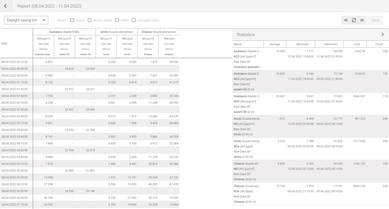
Fig. 186 Statistics of a series
Tip
In both the data grid and the statistics grid, selected rows can be copied.
Refresh and moving data
Data refresh is used to update (reload) the dataset that is being analyzed. This functionality can be accessed by clicking on the button located in the toolbar.
Using the and buttons, located on the report toolbar, it’s possible to move to a previous or next period with respect to the complete period selected, for example by choosing to view 30 days it’s possible to go forward and backward 30 days at a time.
Print
Click the button in the header bar to print the displayed table in .csv format. This operation is the same as doing a data export.
Export
Any data can be exported in .csv format using the export tool. To do so, first make a selection and then click on the button. This will open a window that allows to choose some options (Fig. 187).
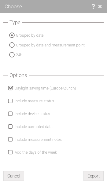
Fig. 187 Export settings
Two types of export can be chosen:
Grouped by date: this is the the export of what you can view with the Report grouped by date,
Grouped by date and measurement point: this is the the export of what you can view with the Report grouped by date and measurement point,
24h: this is the the export of what you can view with the 24h report,
The other options available are:
Daylight saving time: if set, times will refer to Europe/Zurich time zone (enabled by default), otherwise times will be set in UTC+1 (no summer/winter time change)
Include measure status: if set export measurement status,
Include device status: if set it will export the device status if it exists,
Include corrupted data: if set also exports data with a corrupt/suspect status (1, 2, 6),
Include measurement notes: if set also exports any notes that have been added to the measurement.
Add the days of the week: if set it also exports the name of the day of the week.
Warning
Export in 24h format is possible only with data with a sampling less than daily.
Header changes
The header of the exported file is important for those who want to create automatic programs for reading data. Over time this header could change for various reasons, so a numbering was introduced, in the first line of the file, representing the version of the export. The following is intended to keep track over time of the changes made in the various versions. Changes always refer to the previous version.
Screenshots of the export file are offered on a spreadsheet for visual understanding but the file is in .csv format.
The screens show four types of coloring where:
in blue are shown the parts that are added only if the Include measure status option is enabled,
in orange are shown the parts that are added only if the Include device status (from version 1.2) option is enabled,
in green are shown the parts that are added only if the Add the days of the week option is enabled,
in purple are shown the parts that are added only if the Include measurement notes option is enabled,
in red are the changes from the previous version.
Version 1.7
Instead of relative height as a column, altitude is now used, which is the sum of the Z coordinate plus the relative height. The relative height has been reported in the measurement point column.
Export grouping by date
Altitude instead of the column relative height (this reported at the measurement point).
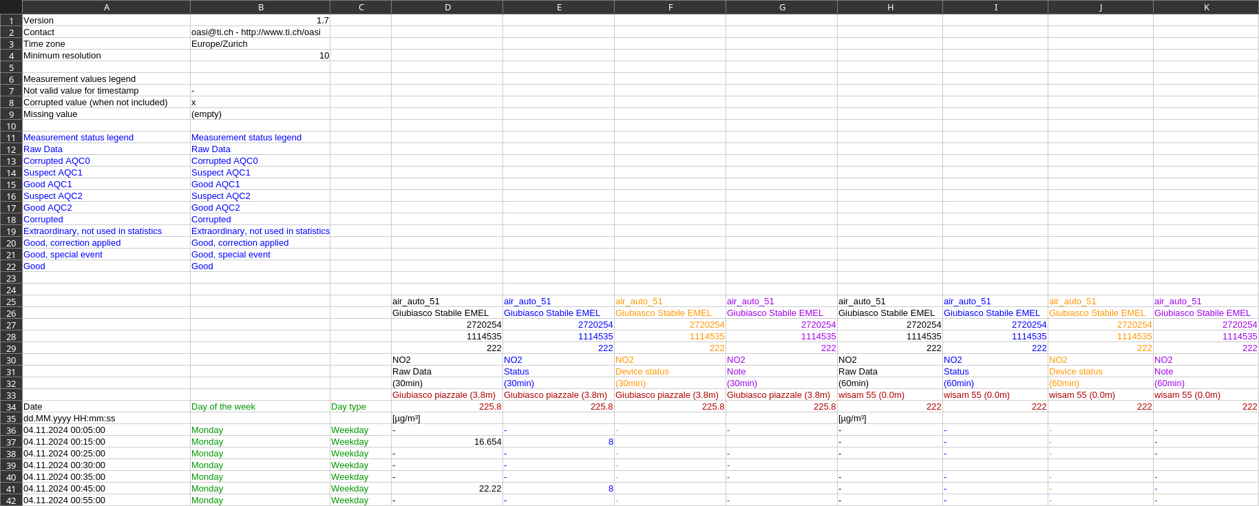
Fig. 188 Grouping export header by date version 1.7
Export grouping by date and measurement point
Altitude instead of the column relative height (this reported at the measurement point).
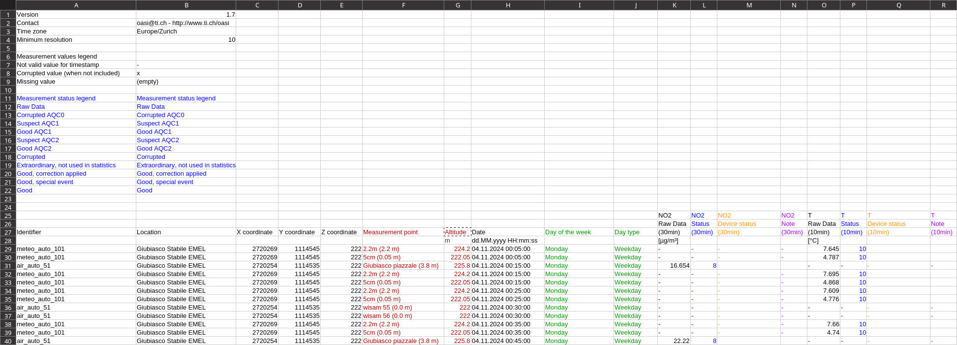
Fig. 189 Grouping export header by date and measuring point version 1.7
24h exportat
Altitude instead of the column relative height (this reported at the measurement point).
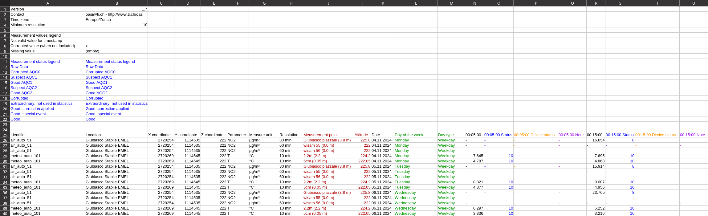
Fig. 190 Header version 1.7 in 24h export
Version 1.6
Relative altitude is a number in a separate row/column.
Export grouping by date
New row with relative altitude as number.
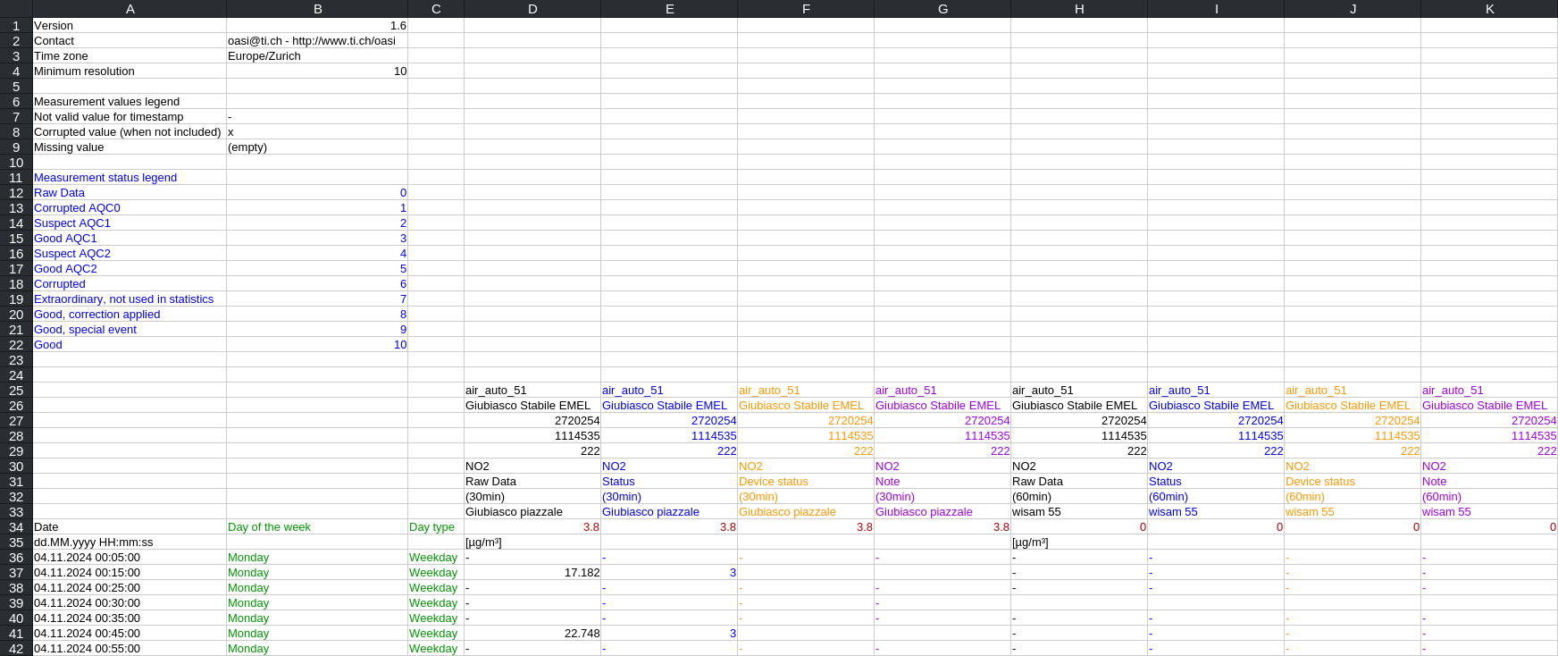
Fig. 191 Grouping export header by date version 1.6
Export grouping by date and measurement point
New column with relative altitude as number.

Fig. 192 Grouping export header by date and measuring point version 1.6
24h exportat
New column with relative altitude as number.
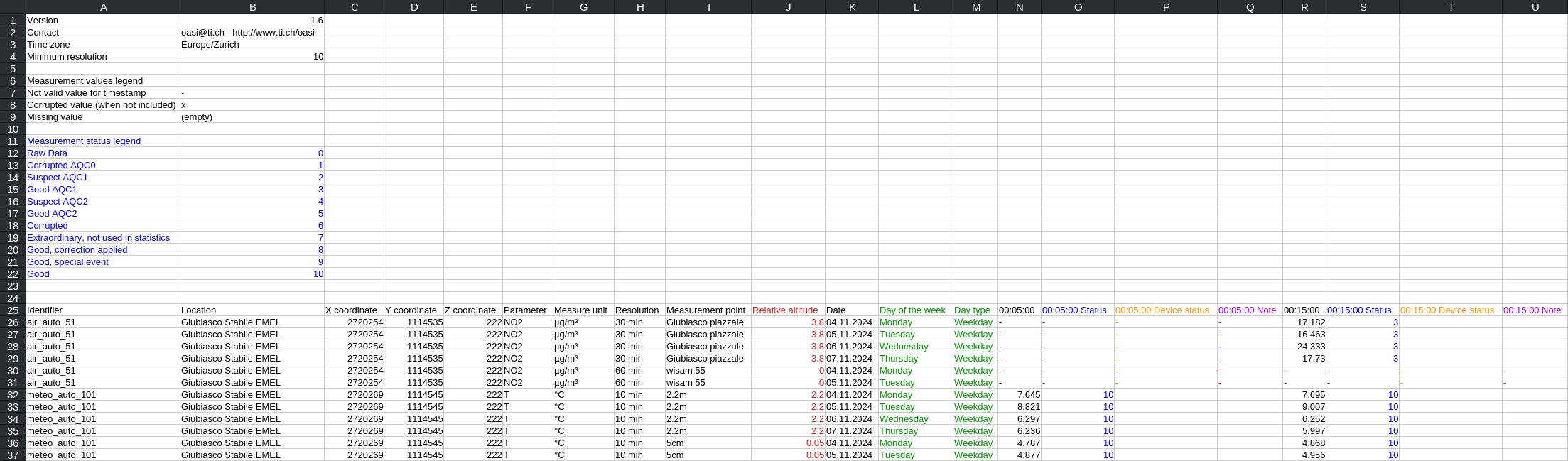
Fig. 193 Header version 1.6 in 24h export
Version 1.5
Notes on measurements can be exported.
Export grouping by date
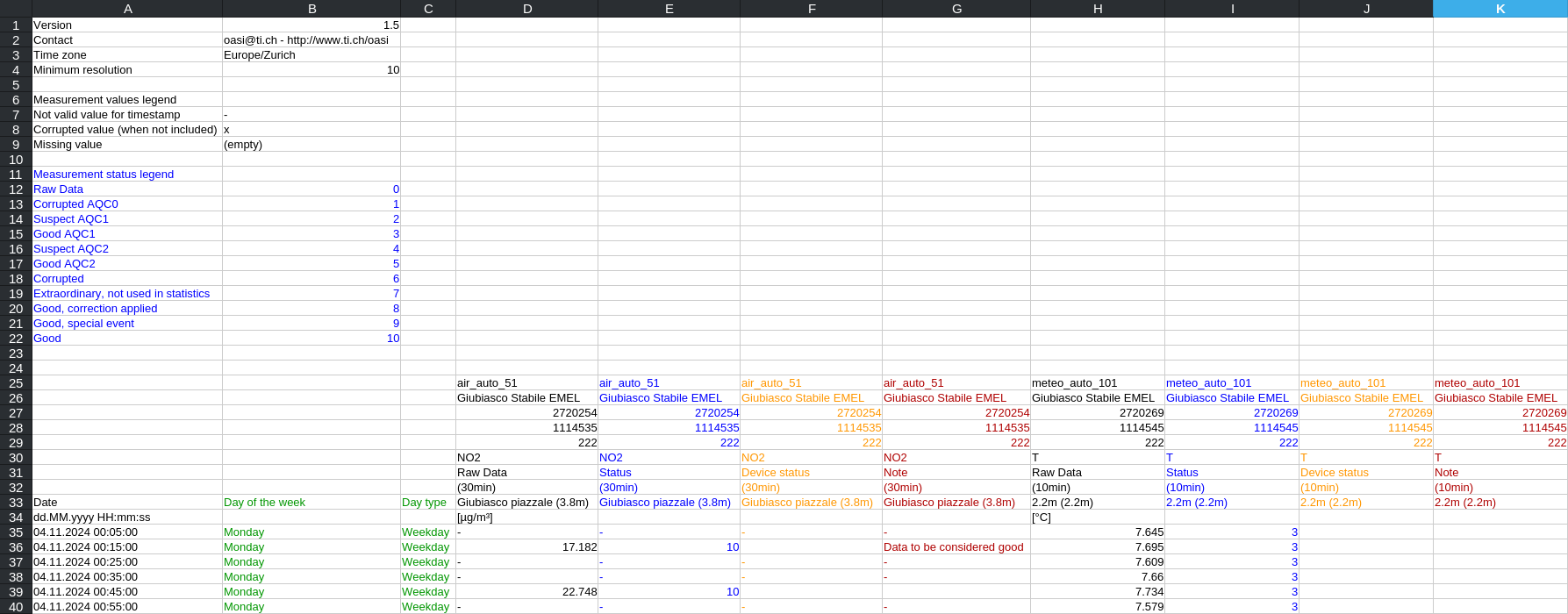
Fig. 194 Grouping export header by date version 1.5
Export grouping by date and measurement point
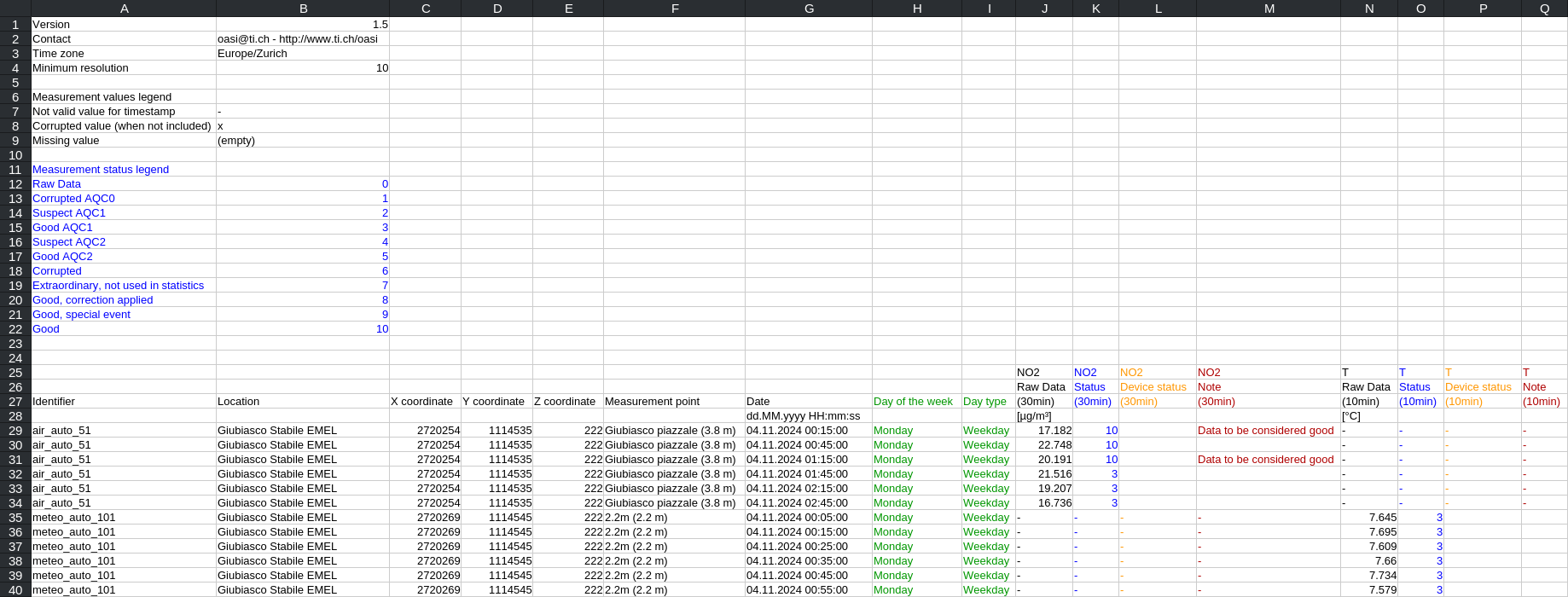
Fig. 195 Grouping export header by date and measuring point version 1.5
24h exportat
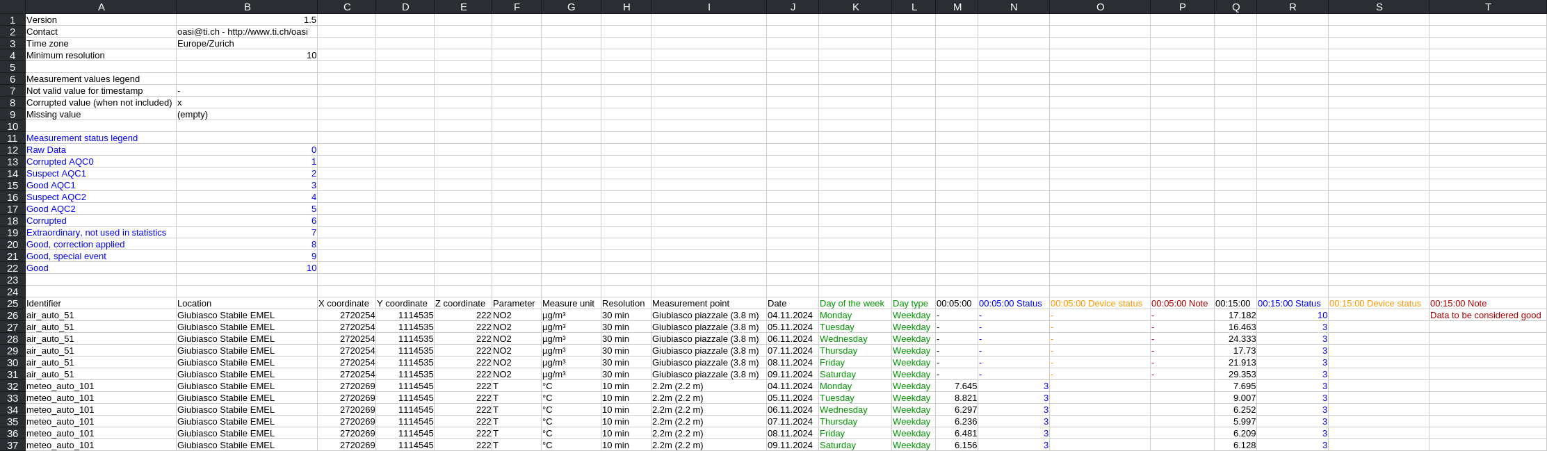
Fig. 196 Header version 1.5 in 24h export
Version 1.4
A new export type has been introduced: export grouping by date and measurement point.
Export grouping by date
No change
Export grouping by date and measurement point
No change
24h exportat
All times are given in a single header as opposed to previous versions that separated depending on sampling.
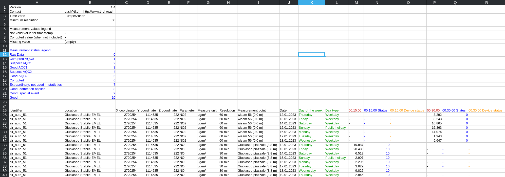
Fig. 197 Header version 1.4 in 24h export
Version 1.3
A new export type has been introduced: export grouping by date and measurement point.
Export grouping by date
No change
Export grouping by date and measurement point
New type of export
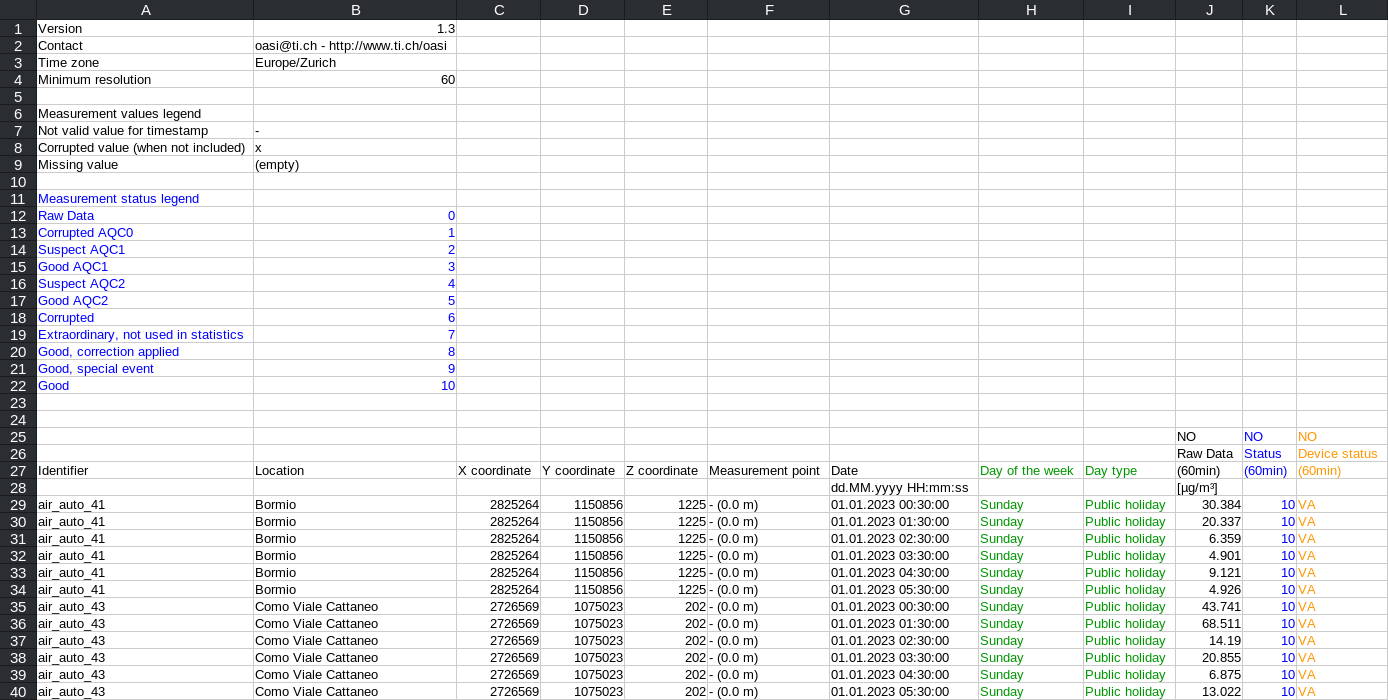
Fig. 198 Grouping export header by date and measuring point version 1.3
24h exportat
No change
Version 1.2
Device status can also be exported if the Include device status option is enabled.
Export grouping by date
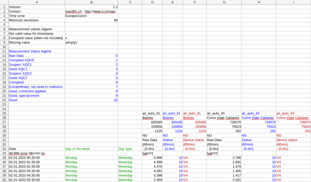
Fig. 199 Grouping export header by date version 1.2
24h exportat

Fig. 200 Header version 1.2 in 24h export
Version 1.1
The x, y and z coordinates are separate numbers in different cells instead of being a string concatenated with the ‘/’ character.
Export grouping by date
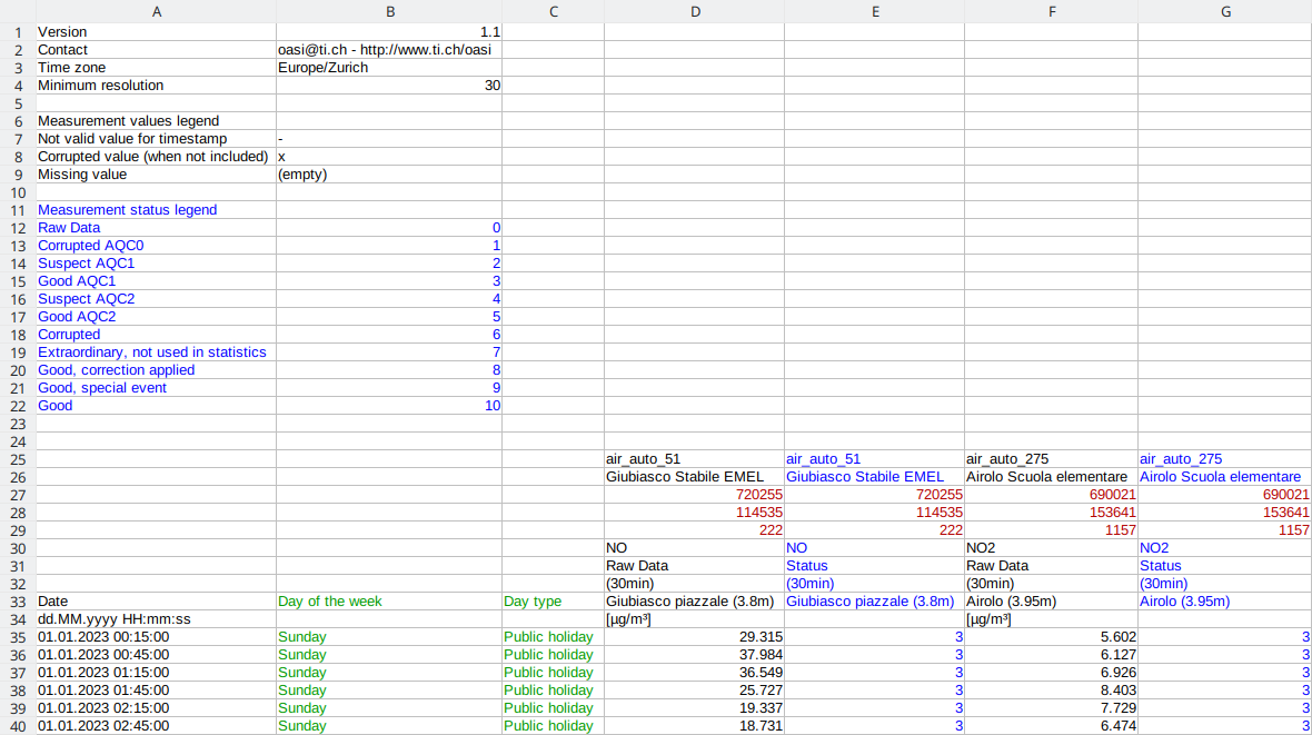
Fig. 201 Grouping export header by date version 1.1
24h exportat

Fig. 202 Header version 1.1 in 24h export
Version 1.0
Location coordinates have been added in this version.
Export grouping by date
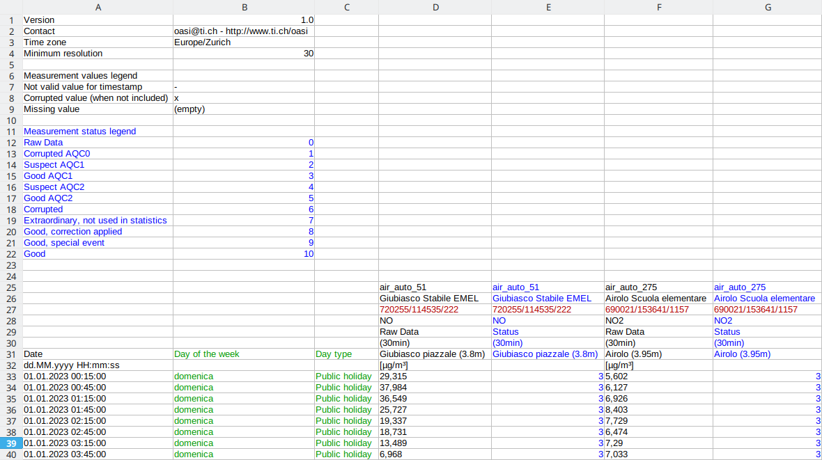
Fig. 203 Grouping export header by date version 1.0
24h exportat
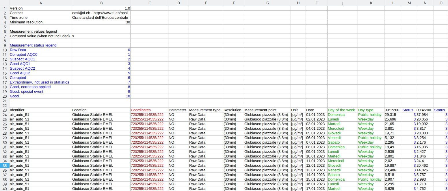
Fig. 204 Header version 1.0 in 24h export
No version
First version of the export that reported no version.
Export grouping by date
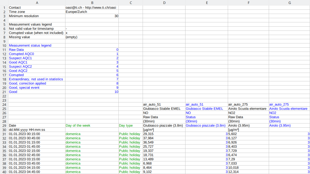
Fig. 205 Grouping export header by date without version
24h exportat
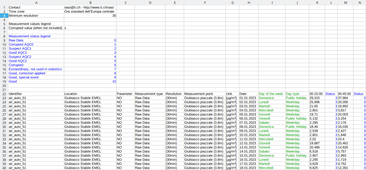
Fig. 206 Header without version in 24h export
Warning
There are non- versioned files that actually mirror the version 1.0 content because the header versioning hadn’t been thought of yet.
Modify data
Some corrections can be made to the data either from chart starting from data set of the selected series or from the data tables in reports.
Selecting the relevant data and right-clicking will open the context menu (Fig. 207) that allows to:
revert a data modification (if it has not yet been registered)
search for any Viasuisse events that may have influenced the data (available only on charts),
go to the alarm view,
go to the maintenance view.
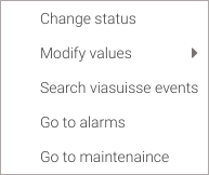
Fig. 207 Charts: contextual menu for modifying status/values
Modify the data status
To better understand what the status of a measurement means we recommend reading the section related to Quality Control.
The validation tool makes it easy to validate measurements from corrupt AQC1 (1) to corrupt (6) and good ACQ1 (3) to good (10). This is not always what one want, and many times there is a need to check the data via the chart. In addition, for measurements marked at state AQC1 Suspect (2) it’s necessary a punctual intervention, and for this it’s possible to change the status in the chart.
To access this feature, select one or more data - from the data set for charts and from the data table for reports - and open the context menu by right-clicking and selecting ; a window will appear in which it’s possible to change the status (Fig. 208). Status can be applied:
[10] Good,
[9] Good (special event),
[7] Extraordinary (no statistics),
or [6] Corrupted
If there are multiple series with the same sampling, it’s possible to make visible series that are not selected also change status to data with the same date and time by checking the Apply to all visible series with the same sampling option.
With Apply to all values in the date range of selected data option activated when changing the status all data that are in the date range will be taken into account by taking into consideration the minimum and maximum date of the selected data. Activating also the Apply to all visible series option will also change the status of the unselected and visible series.
Note
Options Apply to all visible series with the same sampling and Apply to all values in the date range of selected data are only available for modifying data through graphs.
It’s possible to add a note describing the change in measurement status by entering text in the Note field. If any apply a note to a previously annotated measure the old one will be overwritten. To not overwrite a note simply leave the Note field blank.
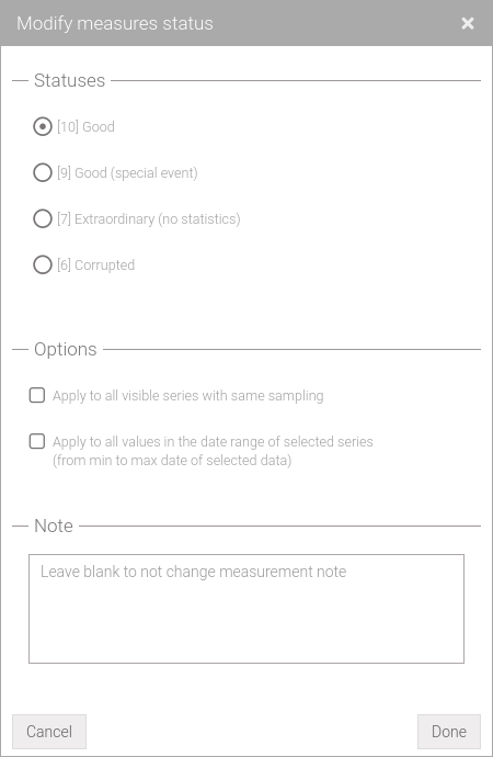
Fig. 208 Window for changing the status of the measures
Attempting to overwrite a status set to [9] Good (special event), [8] Good (correction applied), [7] Extraordinary (no statistics), or [6] Corrupted will trigger an overwrite confirmation window (Fig. 209) will appear.
Fig. 209 Status overwrite warning
This window operates according to the scheme summarized in Table 2:
the first column indicates the current status of the measurement
the first line indicates the desired state
- the cells contain the following indicators:
ok: state modification occurs without any warning
- w: a window is displayed (Fig. 209) notifying the intention to overwrite a state. This window offers two options:
Yes, overwrite: Overwrites the current states
No, keep existing statuses (x,y,z): only states set by automatic controls (ACQ states 0-3) and those set to [10] Good will be modified
6 |
7 |
8 |
9 |
10 |
|
0 |
ok |
ok |
ok |
ok |
ok |
1 |
ok |
ok |
ok |
ok |
ok |
2 |
ok |
ok |
ok |
ok |
ok |
3 |
ok |
ok |
ok |
ok |
ok |
6 |
ok |
w |
w |
w |
w |
7 |
w |
ok |
w |
w |
w |
8 |
w |
w |
ok |
w |
w |
9 |
w |
w |
w |
ok |
w |
10 |
ok |
ok |
ok |
ok |
ok |
Similarly to the status overwrite warning, the system notifies the user via a window (Fig. 210) if an attempt is made to add a note to data that has already been annotated.
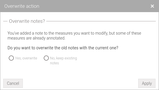
Fig. 210 Note overwrite warning
Attempting to overwrite both status and note at the same time will cause the system to display a window (Fig. 211) asking the user to select an action.
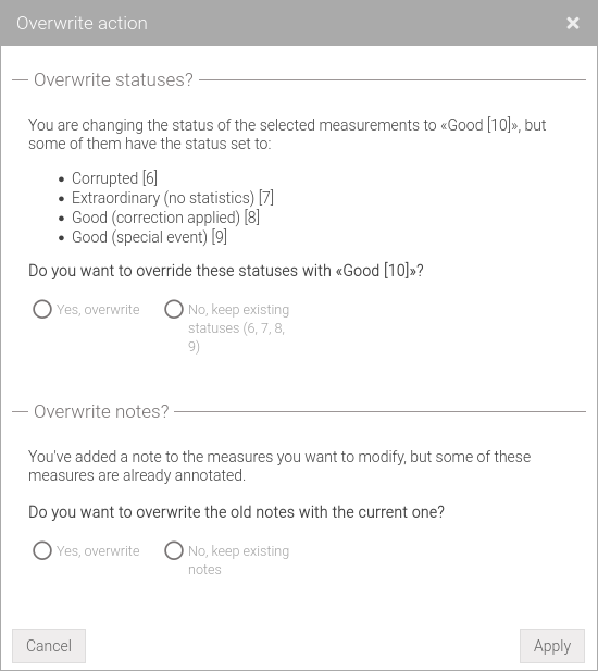
Fig. 211 Status and note overwrite warning
All changed status are not automatically stored in the database and will be indicated with a red triangle in the cell where a change occurred (Fig. 221, Fig. 213). To make the changes effective click on the Save button located at the top right of the screen; if the operation is successful the red triangle will be removed.
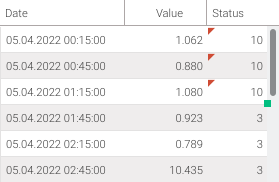
Fig. 212 Charts: cells with locally modified value
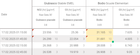
Fig. 213 Reports: cells with locally modified value
Warning
By default, the status displayed for the chart and dataset are:
[0] Raw data
[2] Suspect
[3] Good
[8] Good (correction applied)
[9] Good (special event)
[10] Good
On change the status to [6] Corrupted or [7] Extraordinary (no statistics) they will be automatically hidden so be sure to select the correct filters.
Warning
Can be changed the status only of measurements of the raw data type.
Warning
Data with status [8] Good (correction applied) can only be modified with status [6] Corrupted.
Warning
By default, the report displays [6] Corrupted data with an ‘x’. To view the actual value, check the box Show:corrupted data in the toolbar.
Correct the data values
It is possible to make some corrections on the measured data, either from the charts starting from the table of the dataset of the selected series or from the data tables in the reports, such as:
Add an offset to the values
To add a constant select one or more data - from the data set for charts and from the data table for reports - and open the context menu by right-clicking . Select and then (Fig. 214). In the Start and End fields it’s possible to add a constant for the first selected value and a constant for the last selected value. The constants for the values within the selection are calculated automatically (linearly) based on the Start and End constants. Leaving out the End field the same compensation will be applied to all selected values.
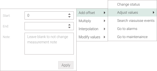
Fig. 214 Charts: correct data by adding compensation
In the charts, the addition of linear compensation is applied to the Start and End values as a function of the reference value, which can be either the date (as in the case of Single chart, Multiple charts and Weekly chart) or the altitude (as in the case of Profile chart).
For reports, the discrimination of the reference value must be specified via the Reference value dropdown menu (Fig. 215), as multiple datasets can be viewed simultaneously. Additionally, data selection is aggregated by location, parameter, and measurement point if is selected (as in a time charts) or by location and parameter if is selected (as in a profile chart) as the reference value.
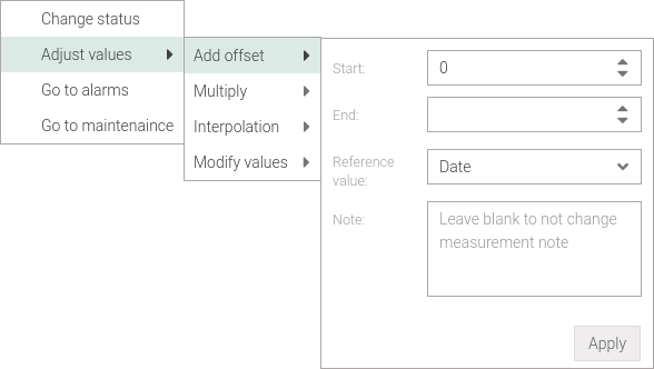
Fig. 215 Reports: correct data by adding compensation
Multiply values
To apply a multiplication select one or more data - from the data set for charts and from the data table for reports - and open the context menu by right-clicking . Select and then (Fig. 216). In the Start and End fields it’s possible to add a multiplicand for the first selected value and a multiplicand for the last selected value. The multiplicands for the values within the selection are calculated automatically (linearly) based on the Start and End multiplicands. Leaving out the End field the same compensation will multiply all values by the same multiplicand.
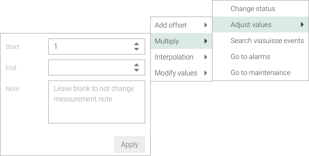
Fig. 216 Charts: correct data by multiplying values
In the charts, the linear multiplication is applied to the Start and End values as a function of the reference value, which can be either the date (as in the case of Single chart, Multiple charts and Weekly chart) or the altitude (as in the case of Profile chart).
For reports, the discrimination of the reference value must be specified via the Reference value dropdown menu (Fig. 217), as multiple datasets can be viewed simultaneously. Additionally, data selection is aggregated by location, parameter, and measurement point if is selected (as in a time charts) or by location and parameter if is selected (as in a profile chart) as the reference value.
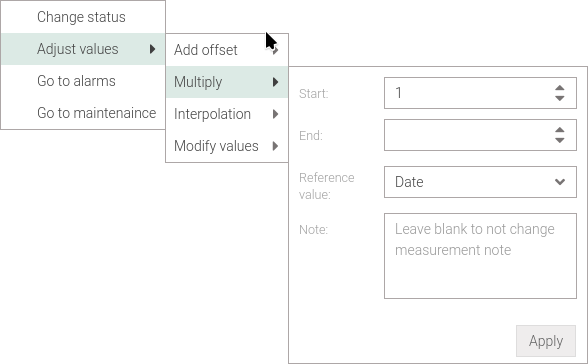
Fig. 217 Reports: correct data by multiplying values
Interpolate the data
In case of a missing data, or even corrupted or suspicious data, values within a given period can be artificially generated (interpolation). This option is available only if at least two values are selected, where the data between the selected value with the mininum date and the value with the maximum date will be considered. To access this feature select at least two data - from the data set for charts and from the data table for reports - and open the context menu by right-clicking . Select and later (Fig. 218). Choose the fill method using Type drop-down menu, the type available are:
: in the start - end interval each data is modified or generated using the line passing through the start and end points.
: in the start - end interval each data is modified or generated using the average of the data from the same day and time two weeks before and the data from the same day and time two weeks later (in case data from previous or following weeks do not exist, only the available data will be used).
The Keep existing option does not alter the existing values between the start and end points, while the Keep extremes option, which can be enabled only if Keep existing is disabled, does not alter the values of the extremes (i.e., value with mininum date and that with maximun date selected).

Fig. 218 Charts: data interpolation
In charts, linear regression is applied to the measured values as a function of the reference value, which can be either the date (as in the case of Single chart, Multiple charts and Weekly chart) or the altitude (as in the case of Profile chart).
For reports, the discrimination of the reference value must be specified via the Reference value dropdown menu (Fig. 219), as multiple datasets can be viewed simultaneously. Additionally, data selection is aggregated by location, parameter, and measurement point if is selected (as in a time charts) or by location and parameter if is selected (as in a profile chart) as the reference value.
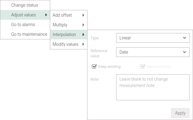
Fig. 219 Reports: data interpolation
Note
The option is not applicable to either the profile chart or the reports.
Modify values
To insert or modify one or more values - from the data set for charts and from the data table for reports - and open the context menu by right-clicking . Select and then (Fig. 220) and enter the desired value in the Value field.
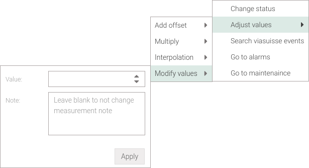
Fig. 220 Charts: fix data by modifying the value
It’s possible to add a note describing why an addition or change to the value is made by entering text in the Note field. If any apply a note to a previously annotated measure the old one will be overwritten. To not overwrite a note simply leave the Note field blank.
All changed status are not automatically stored in the database and will be indicated with a red triangle in the cell where a change occurred (Fig. 221, Fig. 222) i.e., in the Value and/or Status. In addition, the status will automatically be set to [8] Good (correction applied). To make the changes effective click on the Save button located at the top right of the screen; if the operation is successful the red triangle will be removed.
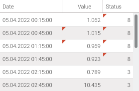
Fig. 221 Charts: cells with locally modified value/status
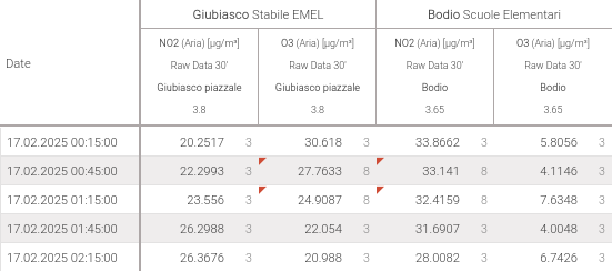
Fig. 222 Reports: cells with locally modified value/status
Changing a measurement value automatically sets the status to [8] Good (correction applied). Consequently, a warning window regarding potential state overwrites may appear (Fig. 223), similar to what happens when states are modified directly. The same rules and options previously described apply in this instance.
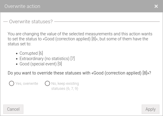
Fig. 223 State overwrites may occur when values are modified
Revert data modification
If data have been modified by changing the status or after a correction, such changes can be reverted only if they have not been saved to the database via the Save button.
To access this feature, select one or more modified data - from the data set for charts and from the data table for reports - and open the context menu by right-clicking and selecting . The data will be restored to its original value.
Perform statistics
For each parameter, statistics such as minimum, maximum and average are automatically created once a day, starting from the raw data.
In some case, after a change in measurements, waiting until the next day to see these statistics is not optimal. Therefore, you can calculate them by clicking on the Perform Statistics button in the toolbar. Only the statistics of the selected series for the period chosen will be recalculated.
Since the calculation of statistics may take time depending on the selection, a warning (Fig. 224) will be displayed if you want to perform this operation or not.
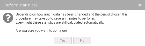
Fig. 224 Statistics recalculation choice message
It’s possible that the user do not have write permissions on some selected series and then the statistics will not be executed. At the end of the operation, if necessary, a window will notify on which series the statistics have not been computed (Fig. 225).
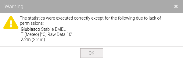
Fig. 225 Not calculated statistics warning
Warning
If a changing of values or measurement status are applied but not saved Perform statistics button will be disabled.