Dashboard
The dashboard (Fig. 57),, divided into rows and columns, allows to activate views, or widgets, which can represent data or simply group of customized selections.
To access this tool click on the icon in the side menu.
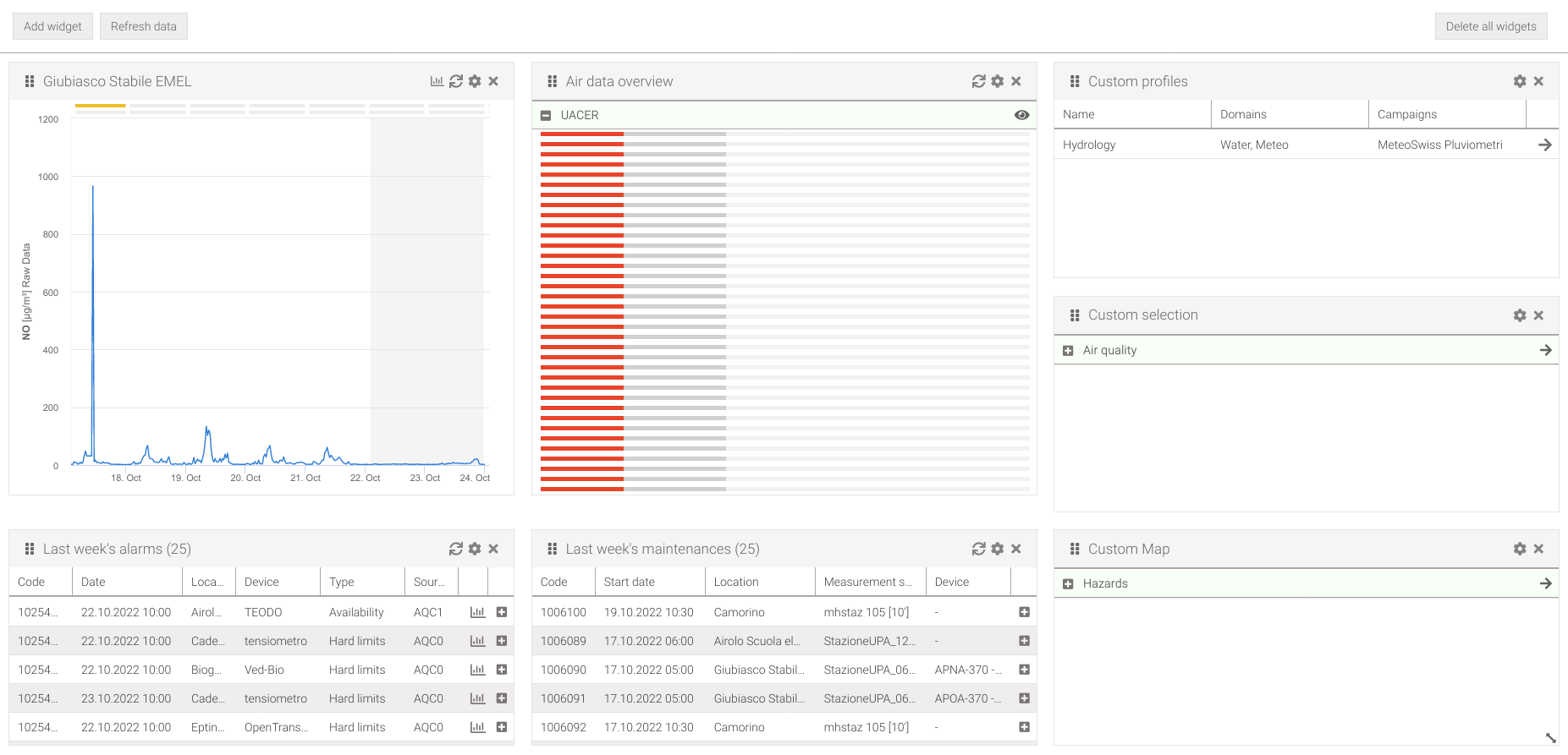
Fig. 57 Dashboard
Widgets
The widgets allow to display temporal data or save custom selections.
The widgets appear as small windows (Fig. 58).
On the left side we have a grip area that is used to move the widget and the title, while on the right side we have buttons that allow the following actions:
reload the data of widgets that display temporal data
allows to change the settings of the widget
remove the widget from the dashboard
There may be other buttons depending on the type of widget.
In the lower right corner, where the icon is present , by holding down the left mouse button and dragging it, the widget can be resized.
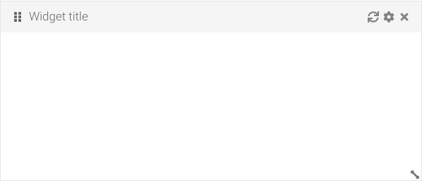
Fig. 58 Widget
Note
The widgets and their layout are saved in a centralized database. This means that the last arrangement given to the dashboard will be represented regardless of what browser, or workstation, is used.
Add a widget
To add a widget click the Add widget button (Fig. 57). Doing so will open a window (Fig. 59) where can be possible to choose the type of widget from the Type drop-down menu, the size of the widget from the Size field, and the settings that change depending on which type was chosen (refer to the section of the relevant widget). When the desired configuration was chosen click on the Add button
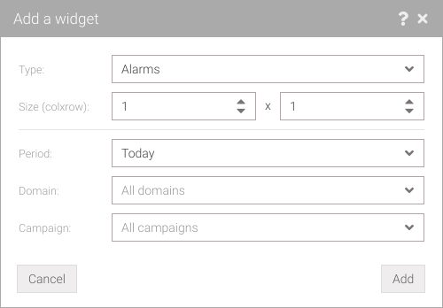
Fig. 59 Add a widget
Move a widget
On the left of the title bar there is a grab area (Fig. 58) that allows to move the widget on the dashboard grid, this can be done by holding down the left mouse button and dragging it to the desired location.
Data visualization widgets
These types of widgets allow for supervision of temporal data by displaying alarms, maintenances, chart or with an overview of the data that have been stored into the database. You can have multiple widgets of the same type (e.g., you can have multiple widgets with chart for different parameters).
Data overview
The data overview widget (Fig. 60) provides an oversight of how much data has been entered into the database during the current day.
Each bar displayed corresponds to a specific measurement point and parameter. The bar is splitted into three sections where the following are displayed:
in light gray the data expected during the day in percentages (so always 100%)
in dark gray the data predicted so far
- in color the data that was actually loaded into the system, where the color indicates:
red: less than 50% imported data than currently expected (dark gray bar)
yellow: Between 50% and 74% of data imported than currently expected (dark gray bar)
green: at least 75% of data imported than currently expected (dark gray bar)
Click on the button to display information about a bar (location, measurement point, parameter,…).
To access it’s settings (Fig. 61) click on the icon where it’s possible to choose:
the domain from the Domain drop-down menu
the campaign from the Campaign drop-down menu (leave blank to refer to all campaigns)
To make the settings actively, click on the Save button.
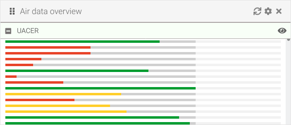
Fig. 60 Widget: data overview
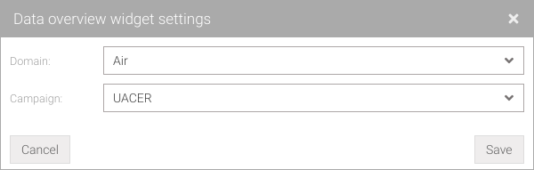
Fig. 61 Widget: data overview settings
Tip
Holding the mouse over a bar for a few moments will display the numerical and percentage data of the data stored.
Alarms
The alarm widget (Fig. 62) provides oversight of the alarms that occurred during a given time period.
To access it’s settings (Fig. 63) click on the icon where it’s possible to choose:
a time period from those preset from the Period drop-down menu
the domain from the Domain drop-down menu (leave blank to refer to all domains)
the campaign from the Campaign drop-down menu (leave blank to refer to all campaigns)
To make the settings actively, click on the Save button.
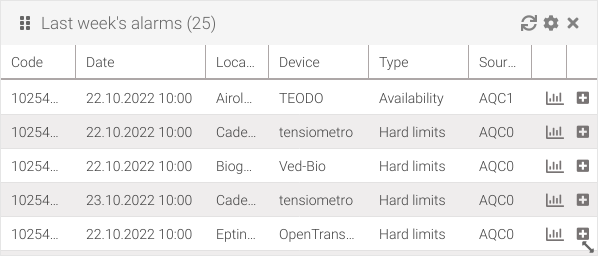
Fig. 62 Widget: alarms
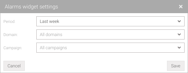
Fig. 63 Widget: allarmi settings
Tip
In the alarm list, selected rows can be copied.
Maintenances
The maintenances widget (Fig. 64) allows for oversight of interventions that occurred in a given time period.
To access it’s settings (Fig. 65) click on the icon where it’s possible to choose:
a time period from those preset from the Period drop-down menu
the domain from the Domain drop-down menu (leave blank to refer to all domains)
the campaign from the Campaign drop-down menu (leave blank to refer to all campaigns)
To make the settings actively, click on the Save button.
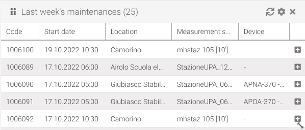
Fig. 64 Widget: maintenances
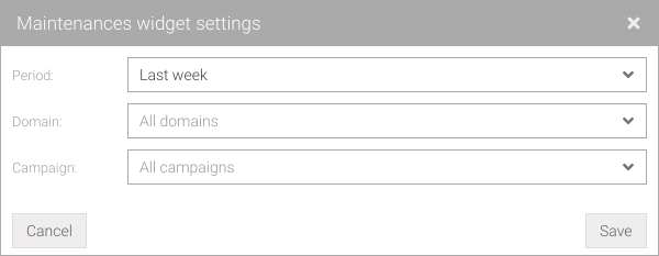
Fig. 65 Widget: v settings
Tip
In the maintenance list, selected rows can be copied.
Chart
The chart widget (Fig. 66) allows to have an oversight of the values of a given parameter over a given time period.
To access it’s settings (Fig. 67) click on the icon where it’s possible to choose:
a time period from those preset from the Period drop-down menu
the resolution of the measurement from the Resolution drop-down menu
the domain from the Domain drop-down menu (optional)
the campaign from the Campaign drop-down menu (optional)
the location from the Location drop-down menu
the parameter from the Parameter drop-down menu
the measurement point from the Measurement point drop-down menu
To make the settings actively, click on the Save button.
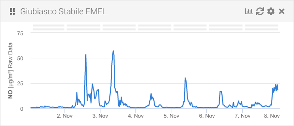
Fig. 66 Widget: chart
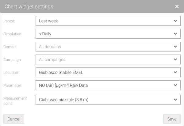
Fig. 67 Widget: chart settings
Customization widgets
These widgets allow to save layer selections in maps, global filter selections or data analysis selections. Multiple selections can be added in the same widget so it’s possible to have only one instance of these widget types.
Custom profiles
The custom profiles widget (Fig. 68) allows to set profiles for the global filter. Clicking on the icon of any row in the table will activate the profile in the global filter by deleting the one currently in use (a warning message will be displayed).
To add a new profile (Fig. 69) click on the icon and fill:
the profile name Name
one or more domains from the Domain drop-down menu
one or more campaigns from the Campaign drop-down menu
one or more administative areas from the Admin areas drop-down menu
To save the new profile, click on the Add profile button. These steps can be repeated to insert more profiles. You can delete a profile by clicking on the icon in the table at the bottom. To make the settings actively, click on the Save button.

Fig. 68 Widget: custom profiles
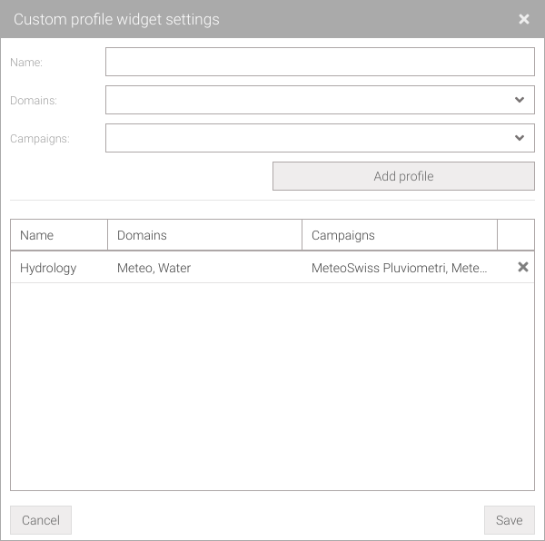
Fig. 69 Widget: custom profiles settings
Tip
Custom profiles can also be loaded directly from the global filter bar.
Tip
In the custom profiles list, selected rows can be copied.
Custom maps
The custom map widget (Fig. 70) allows to set layers for use in Maps. Clicking on the icon of any layers group in the table, they will be selected in the Maps screen deleting those currently in use.
To add a new layers (Fig. 71) click on the icon and fill:
the basemap to display from the Basemap drop-down menu
the zoom and center from the Zoom/Center drop-down menu
the group name in the Name field (several layers can be grouped into a single group)
the geocatalog from the Geocatalog drop-down menu
the layer from the Layer drop-down menu
To save the new layer, click on the Add layer button. These steps can be repeated to insert more layers. You can delete a layer by clicking on the icon in the table at the bottom. To make the settings actively, click on the Save button.
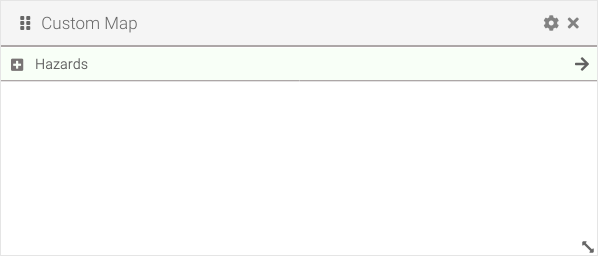
Fig. 70 Widget: custom maps
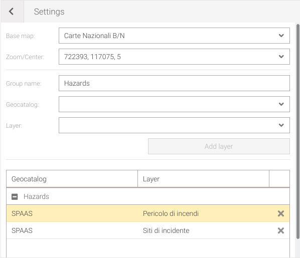
Fig. 71 Widget: custom maps settings
Tip
Custom maps can also be loaded directly from the selection layers in Maps
Tip
In the custom maps list, selected rows can be copied.
Custom data selection
The custom data selection widget (Fig. 72) allows to set data selection for use in Analysis. Clicking on the icon of any selections group in the table, they will be selected in the Analysis screen deleting those currently in use.
To add a new selections (Fig. 73) click on the icon and fill:
the name of the group in the Name field (several data selection can grouped into single group)
the resolution of the measurement from the Resolution drop-down menu
the domain from the Domain drop-down menu (optional)
the campaign from the Campaign drop-down menu (optional)
the location from the Location drop-down menu
the parameter from the Parameter drop-down menu
the measurement point from the Measurement point drop-down menu
To save the new selection, click on the Add selection button. These steps can be repeated to insert more data selections. You can delete a selection by clicking on the icon in the table at the bottom. To make the settings actively, click on the Save button.
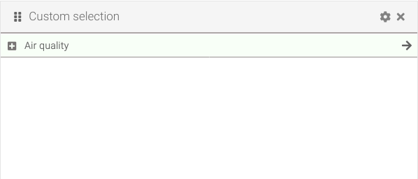
Fig. 72 Widget: custom selections
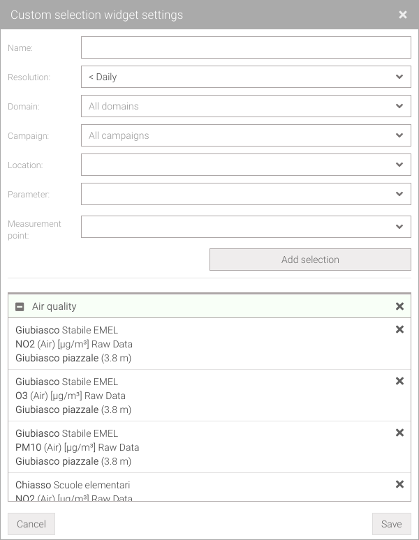
Fig. 73 Widget: custom selections settings
Tip
Custom selection can also be loaded directly from the data selection.
Tip
In the custom data selections list, selected rows can be copied.